Data Visualization Chooser
Select optimal charts • 2026 edition
Data Visualization Selection Guide:
Show the chooser\( \text{Chart Suitability} = f(\text{Data Type}, \text{Purpose}, \text{Audience}) \)
Where:
- Data Type = Categorical, Numerical, Time Series, Geographic, etc.
- Purpose = Comparison, Distribution, Relationship, Composition, etc.
- Audience = Technical, Business, General Public, etc.
This framework helps select the most appropriate visualization based on data characteristics and analytical goals. The choice of chart type should match the story you want to tell with your data.
Examples:
- Bar charts: Best for comparing categorical data
- Line charts: Ideal for showing trends over time
- Scatter plots: Perfect for revealing relationships between variables
- Pie charts: Suitable for showing part-to-whole relationships (limited categories)
The key is matching visualization type to data structure and analytical purpose for maximum clarity and impact.
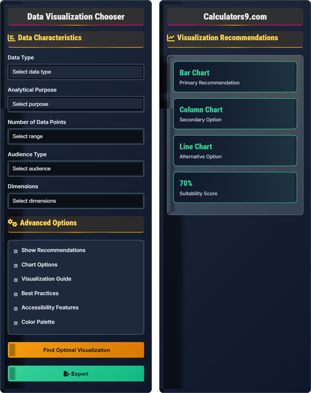
Data Characteristics
Advanced Options
Visualization Recommendations
Visualization Fundamentals
Data visualization is the graphical representation of information and data. By using visual elements like charts, graphs, and maps, data visualization tools provide an accessible way to see and understand trends, outliers, and patterns in data.
\( \text{Chart Suitability} = f(\text{Data Type}, \text{Purpose}, \text{Audience}) \)
Where Chart Suitability=function of data type, purpose, and audience characteristics.
- Match chart type to data structure
- Consider audience technical level
- Focus on clarity over complexity
- Ensure accessibility compliance
Chart Selection Guide
Different chart types serve specific purposes: comparison, distribution, relationship, and composition.
- Comparison: Bar charts, column charts
- Distribution: Histograms, box plots
- Relationship: Scatter plots, bubble charts
- Composition: Pie charts, stacked bars
- Use appropriate scales
- Include clear labels
- Choose readable fonts
- Maintain visual hierarchy
Data Visualization Learning Quiz
Which chart type is most appropriate for comparing sales figures across different regions?
The answer is B) Bar chart. Bar charts are specifically designed for comparing categorical data, making them ideal for comparing sales figures across different regions. Each region gets its own bar, allowing for easy visual comparison of values.
When selecting chart types, consider the primary analytical purpose. For comparison tasks, visual elements that allow for easy magnitude comparison work best. Bar charts excel at this because the human eye can easily compare lengths of bars. Other chart types serve different purposes: line charts for trends over time, pie charts for part-to-whole relationships, scatter plots for relationships between variables.
Categorical Data: Data that can be grouped into distinct categories
Comparative Analysis: Identifying differences between groups or items
Visual Encoding: Using visual elements to represent data attributes
• Use bar charts for categorical comparisons
• Match chart type to analytical purpose
• Consider data structure when selecting visualization
• Horizontal bars for long category names
• Sort bars by value for easier comparison
• Use color strategically to highlight key comparisons
• Using pie charts for more than 5-6 categories
• Applying line charts to non-sequential data
• Not sorting categorical data for easier comparison
Explain the difference between using a line chart and a bar chart, and describe the appropriate use case for each. Provide examples of when each would be most effective.
Line Chart:
• Purpose: Shows trends over time or continuous data
• Visual: Connected data points with lines
• Best for: Time series data, continuous measurements, trend identification
• Example: Monthly sales trends over a year
Bar Chart:
• Purpose: Compares discrete categories
• Visual: Independent rectangular bars
• Best for: Categorical comparisons, part-to-whole relationships
• Example: Sales figures by product category
Key Difference: Line charts emphasize continuity and change over ordered sequences (especially time), while bar charts emphasize discrete comparisons between categories. The choice depends on whether the data represents a sequence (use line) or distinct categories (use bar).
Understanding the fundamental differences between chart types is crucial for effective data communication. Line charts excel at showing patterns and trends in sequential data, while bar charts are superior for categorical comparisons. The visual encoding (lines vs. bars) reflects the underlying data structure (continuous vs. discrete), making the relationship between data and visualization intuitive.
Continuous Data: Data that can take any value within a range
Discrete Data: Data that can only take specific values
Sequential Data: Data with inherent order (like time)
• Use line charts for sequential/trend data
• Use bar charts for categorical data
• Consider the data's natural ordering when selecting chart type
• Combine both for comprehensive analysis
• Use area charts for cumulative trends
• Consider grouped bars for multi-dimensional comparisons
• Using line charts for non-sequential categorical data
• Using bar charts for continuous time series data
• Not considering the data's natural ordering
You need to visualize customer satisfaction scores across 5 departments over the past 12 months. The goal is to show both departmental differences and seasonal trends. What visualization strategy would be most effective, and why?
Recommended Approach: Multi-line chart with separate lines for each department
Reasoning:
1. Trend Analysis: Lines effectively show changes over time (12 months)
2. Comparison: Multiple lines allow for departmental comparisons
3. Pattern Recognition: Trends and seasonal patterns become visible
4. Efficiency: Combines two analytical purposes in one visualization
Alternative: A grouped bar chart could work but would be less effective for showing trends. A heatmap could also show both dimensions but would be harder to read exact values.
This approach addresses both analytical needs: comparing departments (categorical) and analyzing trends over time (sequential).
This example demonstrates the importance of considering multiple analytical purposes simultaneously. The data has both categorical (departments) and sequential (time) dimensions. The chosen visualization (multi-line chart) effectively handles both aspects. This shows how advanced visualization decisions require considering the full complexity of the data and analytical goals.
Multi-Dimensional Data: Data with multiple categorical or continuous variables
Visual Hierarchy: Importance ranking reflected in visualization design
Information Density: Amount of information conveyed per visual element
• Consider all analytical purposes when selecting visualization
• Match visualization complexity to audience capability
• Balance information density with readability
• Use color coding for different categories
• Include trend lines for clearer patterns
• Consider faceting for complex multi-dimensional data
• Using single-purpose charts for multi-dimensional data
• Overloading visualizations with too many elements
• Not considering the audience's analytical needs
A healthcare dashboard needs to display patient outcome data for both clinical staff and executives. The dashboard must be accessible to users with color vision deficiency. What visualization strategies should be employed to ensure accessibility while maintaining analytical effectiveness?
Accessibility Strategies:
1. Color Palette: Use colorblind-safe palettes (avoid red-green combinations)
2. Pattern Fills: Combine color with patterns or textures
3. Contrast Ratios: Maintain 4.5:1 minimum contrast ratio
4. Labels: Include clear data labels, not just color coding
5. Alternatives: Provide data tables alongside charts
Implementation:
• Use blue-orange or purple-green color combinations
• Add cross-hatching or dots for different data series
• Ensure all information is available through text labels
• Test with colorblind simulation tools
Result: Visualizations that are both analytically effective and accessible to all users.
This example highlights how accessibility considerations can enhance rather than compromise visualization effectiveness. By incorporating multiple visual encodings (color, pattern, labels), the visualization becomes more robust and informative. Accessibility improvements often benefit all users, not just those with disabilities, demonstrating that inclusive design is good design.
Color Vision Deficiency: Reduced ability to distinguish colors
Universal Design: Design accessible to all users
Visual Encodings: Different ways to represent data visually
• Never rely solely on color to convey information
• Test visualizations with accessibility tools
• Provide alternative access methods for all visualizations
• Use online colorblind simulators to test designs
• Combine multiple visual encodings for redundancy
• Provide text alternatives for all visual content
• Using only color to differentiate data series
• Not testing visualizations for accessibility
• Assuming accessibility doesn't affect analytical effectiveness
Which of the following is the most effective approach when visualizing data with many categories (20+)?
The answer is B) Use a horizontal bar chart sorted by value. Horizontal bar charts are ideal for many categories because they allow for longer category labels and can accommodate more bars than vertical charts. Sorting by value makes comparison easier. This approach preserves the detail of individual categories while maintaining readability.
When dealing with many categories, the key is maintaining readability while preserving information. Pie charts become ineffective with many slices because slices become indistinguishable. Line charts with many series become cluttered. Grouping categories loses detail. Horizontal bar charts provide the best balance of readability and information preservation for many categories.
Information Density: Amount of information per visual unit
Readability: Ease of extracting information from visualization
Data Aggregation: Combining data points into fewer categories
• Limit pie charts to 5-6 categories maximum
• Use horizontal bars for many categories with long labels
• Sort categorical data for easier comparison
• Use scrollable visualizations for many categories
• Consider faceting for complex multi-category data
• Use tooltips for additional detail without cluttering
• Using pie charts for many categories
• Cluttering visualizations with too much information
• Not considering the audience's ability to process complex data
FAQ
Q: How do I choose the right chart type for my data?
A: The framework is: \( \text{Chart Suitability} = f(\text{Data Type}, \text{Purpose}, \text{Audience}) \).
Data Type Considerations:
- Categorical: Bar charts, column charts
- Numerical: Histograms, scatter plots
- Time Series: Line charts, area charts
- Geographic: Maps, choropleths
Purpose Considerations:
- Comparison: Bar charts
- Distribution: Histograms
- Relationship: Scatter plots
- Composition: Pie charts (limited categories)
Match these factors to find the optimal visualization.
Q: What are the most important principles for effective data visualization?
A: Key principles include:
- Clarity: Remove unnecessary elements ("chart junk")
- Accuracy: Represent data truthfully without distortion
- Accessibility: Ensure visualizations work for all users
- Context: Provide sufficient information to interpret data
- Hierarchy: Emphasize the most important information
Focus on the story your data tells and ensure the visualization supports that narrative without distraction.