Image Resizer
Professional dimension editor • Pixel precision
Image resizing uses sophisticated interpolation algorithms to change pixel dimensions while maintaining visual quality. The process involves calculating new pixel values based on surrounding pixels to create smooth transitions and preserve image details.
Key Technologies:
- Bilinear Interpolation: Smooth scaling for moderate size changes
- Bicubic Interpolation: Higher quality scaling with smoother gradients
- Lanczos Resampling: High-quality scaling with sharp details
- Aspect Ratio Preservation: Maintains proportional relationships
- Smart Cropping: Intelligent content-aware resizing
Web Performance Impact: Properly sized images reduce bandwidth usage by up to 90% and improve page load times. Responsive image sizing ensures optimal display across all devices while minimizing resource consumption.
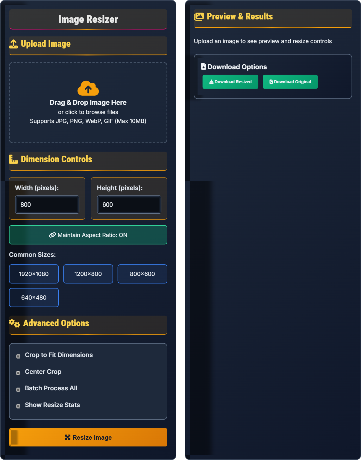
Upload Image
Drag & Drop Image Here
or click to browse files
Supports JPG, PNG, WebP, GIF (Max 10MB)
Dimension Controls
Advanced Options
Preview & Results
Download Options
Image Resizing Fundamentals
Bilinear Interpolation: Calculates new pixel values using weighted averages of the four nearest pixels. Suitable for moderate scaling with reasonable quality.
Bicubic Interpolation: Uses 16 neighboring pixels for smoother results, especially for enlarging images. Provides better quality than bilinear but requires more computation.
Lanczos Resampling: High-quality algorithm using sinc functions, ideal for preserving sharp details and minimizing artifacts during scaling.
Aspect ratio (width:height) should be maintained to prevent image distortion:
- Formula: newHeight = (originalHeight × newWidth) ÷ originalWidth
- Common Ratios: 1:1 (square), 4:3 (standard), 16:9 (widescreen)
- Calculation: Preserve proportions when changing dimensions
- Always consider display requirements
- Maintain aspect ratios for natural appearance
- Use appropriate scaling algorithm for content
- Test resized images at actual display size
Responsive Image Sizing
Optimal image sizes for different devices and applications:
- Mobile: 320x240 to 768x576 pixels
- Tablet: 768x576 to 1024x768 pixels
- Desktop: 1024x768 to 1920x1080 pixels
- Print: 300 DPI minimum (3600x2400 for 12x8 inch)
When resizing doesn't perfectly fit aspect ratio:
- Fit: Maintain aspect ratio with letterboxing
- Fill: Crop to fill entire area
- Stretch: Distort to fit dimensions (avoid)
- Smart: Content-aware cropping
- Resize to exact display dimensions
- Consider multiple device sizes
- Use vector formats when possible
- Implement responsive image techniques
Image Resizing Quiz
If an image has dimensions of 800x600 pixels, what is its aspect ratio?
The answer is A) 4:3. To find the aspect ratio, divide both dimensions by their greatest common divisor (GCD). The GCD of 800 and 600 is 200. So, 800÷200 = 4 and 600÷200 = 3, giving us an aspect ratio of 4:3.
Aspect ratio is a fundamental concept in image processing that describes the proportional relationship between width and height. It's calculated by dividing both dimensions by their greatest common divisor to express the ratio in its simplest form. Understanding aspect ratios is crucial for maintaining image proportions during resizing.
Aspect Ratio: Proportional relationship between width and height
Greatest Common Divisor (GCD): Largest number that divides both dimensions
Proportional Scaling: Maintaining dimensional relationships
• Calculate aspect ratio using GCD method
• Maintain aspect ratio to prevent distortion
• Common ratios: 4:3, 16:9, 3:2
• Divide dimensions by GCD to simplify ratio
• Use 4:3 for standard photos
• Use 16:9 for widescreen content
• Not simplifying the ratio to lowest terms
• Confusing width and height in ratio
• Forgetting to maintain aspect ratio
Explain how to calculate new dimensions when resizing an image while maintaining aspect ratio. Provide the formula and a practical example.
Scaling Formula: When maintaining aspect ratio, if you change one dimension, the other must change proportionally.
Formula: newHeight = (originalHeight × newWidth) ÷ originalWidth
Practical Example: Original image is 1200x800 pixels. If we want to resize to 600 pixels wide:
- New height = (800 × 600) ÷ 1200 = 400 pixels
- New dimensions: 600x400 pixels
- Aspect ratio remains 3:2 (1200:800 = 600:400)
This ensures the image maintains its proportional appearance without distortion.
Proportional scaling is essential for maintaining image quality during resizing. The cross-multiplication method ensures that the relationship between width and height remains constant. This prevents stretching or squashing effects that occur when aspect ratio is ignored during resizing operations.
Proportional Scaling: Maintaining dimensional relationships during resizing
Cross-Multiplication: Mathematical method for proportional calculations
Dimensional Relationships: Proportional connections between measurements
• Always maintain aspect ratio for natural appearance
• Use cross-multiplication for proportional scaling
• Calculate one dimension based on the other
• Calculate one dimension, then derive the other
• Use aspect ratio lock in editing software
• Verify calculations by checking proportions
• Changing dimensions independently without proportion
• Forgetting to recalculate dependent dimension
• Not verifying aspect ratio after resizing
An image has dimensions of 2400x1600 pixels (3,840,000 pixels total). If it's resized to 800x533 pixels (426,400 pixels total), calculate the percentage reduction in pixel count and estimate the file size reduction.
Calculations:
- Pixel reduction: (3,840,000 - 426,400) ÷ 3,840,000 × 100 = 88.9%
- File size reduction: Approximately 85-90% (slightly less than pixel reduction due to metadata)
The image has 88.9% fewer pixels, which typically translates to 85-90% smaller file size, representing significant bandwidth and storage savings.
Pixel count reduction directly correlates with file size reduction, though the relationship isn't perfectly linear due to image metadata and compression overhead. The square relationship (width × height) means that halving both dimensions reduces pixel count by 75%, demonstrating the significant impact of appropriate sizing on file efficiency.
Pixel Count: Total number of pixels in an image (width × height)
File Size Reduction: Percentage decrease in storage requirements
Bandwidth Savings: Reduced data transfer requirements
• Pixel count reduction approximates file size reduction
• Square relationship: halving dimensions reduces pixels by 75%
• Proper sizing can reduce file sizes by 80-90%
• Calculate pixel count before and after resizing
• Consider display requirements for sizing
• Estimate bandwidth savings from pixel reduction
• Not calculating actual pixel reduction
• Overlooking the relationship between pixels and file size
• Not considering display requirements
You're designing a website that needs to display a hero image at 1920x600 pixels on desktop, 1024x300 pixels on tablet, and 320x200 pixels on mobile. Calculate the optimal file sizes for each version assuming 75% compression and explain the responsive implementation strategy.
Optimal Versions:
- Desktop (1920x600): ~1.15M pixels → ~150KB after 75% compression
- Tablet (1024x300): ~307K pixels → ~40KB after 75% compression
- Mobile (320x200): ~64K pixels → ~8KB after 75% compression
Implementation Strategy: Use HTML5 srcset attribute to serve appropriate image based on device capabilities. This prevents mobile devices from downloading unnecessarily large files, saving bandwidth and improving loading speed.
Responsive image sizing combines appropriate dimensions with compression for maximum efficiency. The srcset attribute enables browsers to select the most appropriate image based on screen resolution and viewport size. This approach prevents mobile devices from downloading oversized desktop images, significantly improving performance.
Responsive Images: Different sizes for different devices
Srcset Attribute: HTML attribute for responsive image serving
Bandwidth Efficiency: Optimizing data usage for different contexts
• Create appropriately sized versions for each device
• Use srcset for responsive image serving
• Consider mobile-first sizing approach
• Implement picture element for art direction
• Use WebP with fallback to JPEG
• Consider lazy loading for below-fold images
• Serving same image to all devices
• Not using responsive image techniques
• Ignoring device-specific optimization
Which scaling algorithm provides the highest quality results for image enlargement?
The answer is D) Lanczos Resampling. Lanczos resampling uses sinc functions to calculate new pixel values, providing the highest quality results for image enlargement. It preserves sharp details and minimizes artifacts like ringing and aliasing, though it requires more computational resources than other methods.
Scaling algorithms vary in quality and computational requirements. Nearest neighbor creates pixelated results, bilinear provides basic smoothing, bicubic offers better quality with moderate computation, while Lanczos provides the highest quality at the cost of increased processing time. The choice depends on the balance between quality requirements and performance constraints.
Interpolation Algorithm: Method for calculating intermediate pixel values
Lanczos Resampling: High-quality algorithm using sinc functions
Computational Complexity: Processing resources required for algorithm
• Lanczos provides highest quality but slowest processing
• Bicubic offers good balance of quality and speed
• Choose algorithm based on quality requirements
• Use Lanczos for critical quality requirements
• Use bicubic for general-purpose scaling
• Consider processing time vs quality trade-offs
• Using nearest neighbor for quality-sensitive applications
• Not considering computational requirements
• Applying same algorithm to all scaling operations
FAQ
Q: What's the difference between scaling and cropping, and when should I use each?
A: Scaling changes the dimensions of an image while maintaining all original content. The image is stretched or shrunk proportionally to fit new dimensions.
Cropping removes portions of an image to fit specific dimensions, keeping only the desired portion. This is useful when aspect ratios don't match.
When to use each:
- Scaling: When aspect ratios match or you want to preserve all content
- Cropping: When you need exact dimensions that don't match the original aspect ratio
- Combined: First scale to approximate size, then crop to exact dimensions
Q: How do I determine the right resolution for printing my photos?
A: Printing resolution is measured in DPI (dots per inch). For high-quality prints:
- Standard quality: 150 DPI minimum
- High quality: 300 DPI recommended
- Large format: 100-150 DPI (viewed from distance)
Calculation: Required pixel dimensions = Physical size (inches) × DPI
- 8x10 inch print at 300 DPI = 2400x3000 pixels
- 16x20 inch print at 300 DPI = 4800x6000 pixels
For best results, ensure your original image has sufficient resolution before resizing. Enlarging low-resolution images will result in poor print quality. When in doubt, it's better to have more pixels than required.