Animation Keyframes Generator
CSS animation creator • Live preview
CSS Animation Keyframes:
Show the generatorBasic Syntax:
- @keyframes: Defines animation sequence
- from/to: 0% to 100% animation
- 0%-100%: Precise control over animation
- Properties: Transform, opacity, color, etc.
Example:
@keyframes slideIn {
  0% { transform: translateX(-100%); opacity: 0; }
  100% { transform: translateX(0); opacity: 1; }
}

.element {
  animation: slideIn 1s ease-in-out;
}
CSS keyframes provide precise control over animation timing and effects without JavaScript.
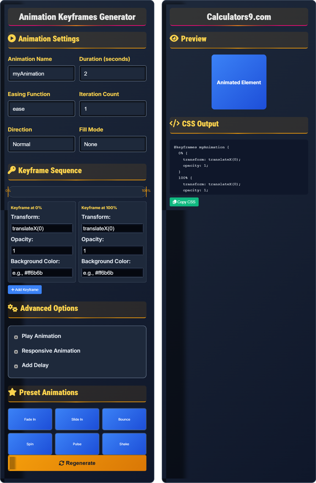
Animation Settings
Animation Name
Duration (seconds)
Easing Function
Iteration Count
Direction
Fill Mode
Keyframe Sequence
Advanced Options
Preset Animations
Preview
CSS Output
Comprehensive Animation Guide
CSS keyframes allow you to create complex animations by defining the intermediate steps in an animation sequence. They provide fine-grained control over how properties change over time, enabling sophisticated animations without JavaScript.
CSS animations consist of several components:
Animation → Apply to elements
Timing → Control duration and easing
Iteration → Repeat behavior
These components work together to create fluid animations.
CSS animations offer several advantages:
- Performance: Hardware-accelerated rendering
- Efficiency: No JavaScript required
- Scalability: Work across devices
- Customization: Full control over timing
- Performance: Animate transform and opacity
- Accessibility: Respect prefers-reduced-motion
- Duration: Keep animations under 1 second
- Purpose: Serve functional purposes
Animation Fundamentals
Define animation steps with percentage values.
@keyframes name {
  0% { property: value; }
  100% { property: value; }
}
Example: @keyframes slideIn { 0% { transform: translateX(-100%); } 100% { transform: translateX(0); } }
- 0% = beginning, 100% = end
- Intermediate steps possible
- Any animatable CSS property
- Combine with animation property
Development Tips
Optimize animations for smooth performance.
- Transform: translate, rotate, scale
- Opacity: 0 to 1 changes
- Will-change: hint for browser
- Hardware acceleration: 3D transforms
- Test performance on mobile devices
- Consider accessibility preferences
- Keep animations purposeful
- Provide controls when appropriate
Animation Learning Quiz
What is the correct syntax for defining a CSS keyframes animation?
The answer is B) @keyframes myAnimation { 0% { property: value; } }. The @keyframes rule is used to define the animation sequence with the animation name following the @keyframes keyword. The animation steps are defined using percentage values from 0% to 100%.
Understanding the correct syntax is fundamental to creating CSS animations. The @keyframes rule is a CSS at-rule that defines the animation sequence. The name of the animation is used to reference it when applying the animation to elements. The percentage values define the stages of the animation.
@keyframes: CSS at-rule for animation definition
Animation Name: Identifier for the animation
Percentage Steps: Stages of animation sequence
• Use @keyframes keyword
• Define name after @keyframes
• Use % for timing steps
• Use descriptive animation names
• Define 0% and 100% steps
• Add intermediate steps for complex animations
• Using incorrect at-rule syntax
• Forgetting percentage signs
• Not defining complete animation sequence
How would you create a fade-in animation that lasts 2 seconds using CSS keyframes? Provide the complete code and explain each part.
@keyframes fadeIn {
  0% { opacity: 0; }
  100% { opacity: 1; }
}

.fade-element {
  animation: fadeIn 2s ease-in-out;
}
Explanation:
- @keyframes fadeIn: Defines the animation with name 'fadeIn'
- 0% { opacity: 0; }: Starts invisible
- 100% { opacity: 1; }: Ends fully visible
- animation: fadeIn 2s ease-in-out;: Applies animation to element
This example demonstrates the relationship between keyframes definition and animation application. The keyframes define what happens (fade from 0 to 1 opacity), while the animation property defines how it happens (2 seconds duration, ease-in-out timing).
Opacity: Transparency level (0-1)
Animation Duration: Time for animation completion
Easing Function: Speed curve of animation
• Define 0% and 100% states
• Use animatable properties
• Apply with animation property
• Use opacity for fade effects
• Combine with transform for complex animations
• Test different easing functions
• Using non-animatable properties
• Forgetting to apply animation to element
• Incorrect percentage values
You need to create a button that slides in from the left and fades in simultaneously when the page loads. How would you implement this using CSS keyframes?
@keyframes slideInFromLeft {
  0% {
    transform: translateX(-100px);
    opacity: 0;
  }
  100% {
    transform: translateX(0);
    opacity: 1;
  }
}

.slide-button {
  animation: slideInFromLeft 0.8s ease-out;
}
This creates a simultaneous slide and fade effect by animating both transform and opacity properties together.
This example demonstrates how multiple properties can be animated simultaneously within a single keyframes definition. The transform property handles the sliding motion while opacity creates the fade effect. Both properties change together to create a coordinated animation.
Simultaneous Animation: Multiple properties changing together
Transform: Position, scale, rotation changes
Coordination: Properties changing in sync
• Multiple properties per keyframe
• Properties animate simultaneously
• Use compatible easing functions
• Combine transform and opacity for smooth effects
• Use translateX for horizontal movement
• Test animation timing carefully
• Animating incompatible properties
• Using different durations for coordination
• Not considering performance impact
An animation is causing performance issues on mobile devices. How would you optimize the animation to maintain visual quality while improving performance?
Optimize the animation using these strategies:
.optimized-element {
  /* Animate only transform and opacity */
  animation: optimizedAnimation 1s ease-in-out;
  /* Enable hardware acceleration */
  will-change: transform, opacity;
  /* Or force hardware acceleration */
  transform: translateZ(0);
}

@keyframes optimizedAnimation {
  0% {
    transform: translateX(-50px) scale(0.8);
    opacity: 0;
  }
  100% {
    transform: translateX(0) scale(1);
    opacity: 1;
  }
}
Additional optimizations:
- Only animate transform and opacity properties
- Use will-change for browser hints
- Consider using translateZ(0) for hardware acceleration
- Reduce animation complexity when possible
Performance optimization for animations involves understanding which CSS properties trigger expensive layout and paint operations. Properties like transform and opacity can be handled by the GPU without affecting layout, making them ideal for animations.
GPU Acceleration: Hardware processing
Paint Operations: Rendering processLayout Triggers: Expensive calculations
• Animate only transform and opacity
• Use hardware acceleration
• Test on target devices
• Use translate instead of left/right
• Use scale instead of width/height
• Test with browser dev tools
• Animating layout-triggering properties
• Not testing on mobile devices
• Using complex animations unnecessarily
Which CSS properties can be animated using keyframes?
The answer is C) Most numeric and color properties. CSS keyframes can animate most properties that have numeric values (like width, height, margin, padding, opacity) and color properties (like background-color, color, border-color). However, not all properties are animatable.
Understanding which properties can be animated is important for creating effective animations. Generally, properties with numeric values or color values can be interpolated between states. Properties that involve layout changes may impact performance, so transform and opacity are preferred.
Animatable: Can change gradually between values
Interpolation: Gradual change between states
Numeric Properties: Have measurable values
• Numeric values can be animated
• Color values can be animated
• Layout properties may impact performance
• Prefer transform over position properties
• Use opacity for visibility changes
• Check MDN for animatable properties
• Trying to animate non-animatable properties
• Animating layout-triggering properties
• Not considering performance implications
FAQ
Q: What's the difference between CSS animations and CSS transitions?
A: CSS transitions animate between two states (like hover), while CSS animations run automatically with full control over each step.
Transitions: transition: property duration; → Requires state change
Animations: animation: name duration; → Runs automatically with @keyframes
Use transitions for simple state changes and animations for complex, multi-step sequences.
Q: How do I make an animation repeat indefinitely?
A: Set the iteration-count property to infinite:
animation: myAnimation 2s infinite; → Runs forever
animation-iteration-count: infinite; → Separate property
You can also use other values like 3 for 3 iterations, or combine with direction properties for ping-pong effects.