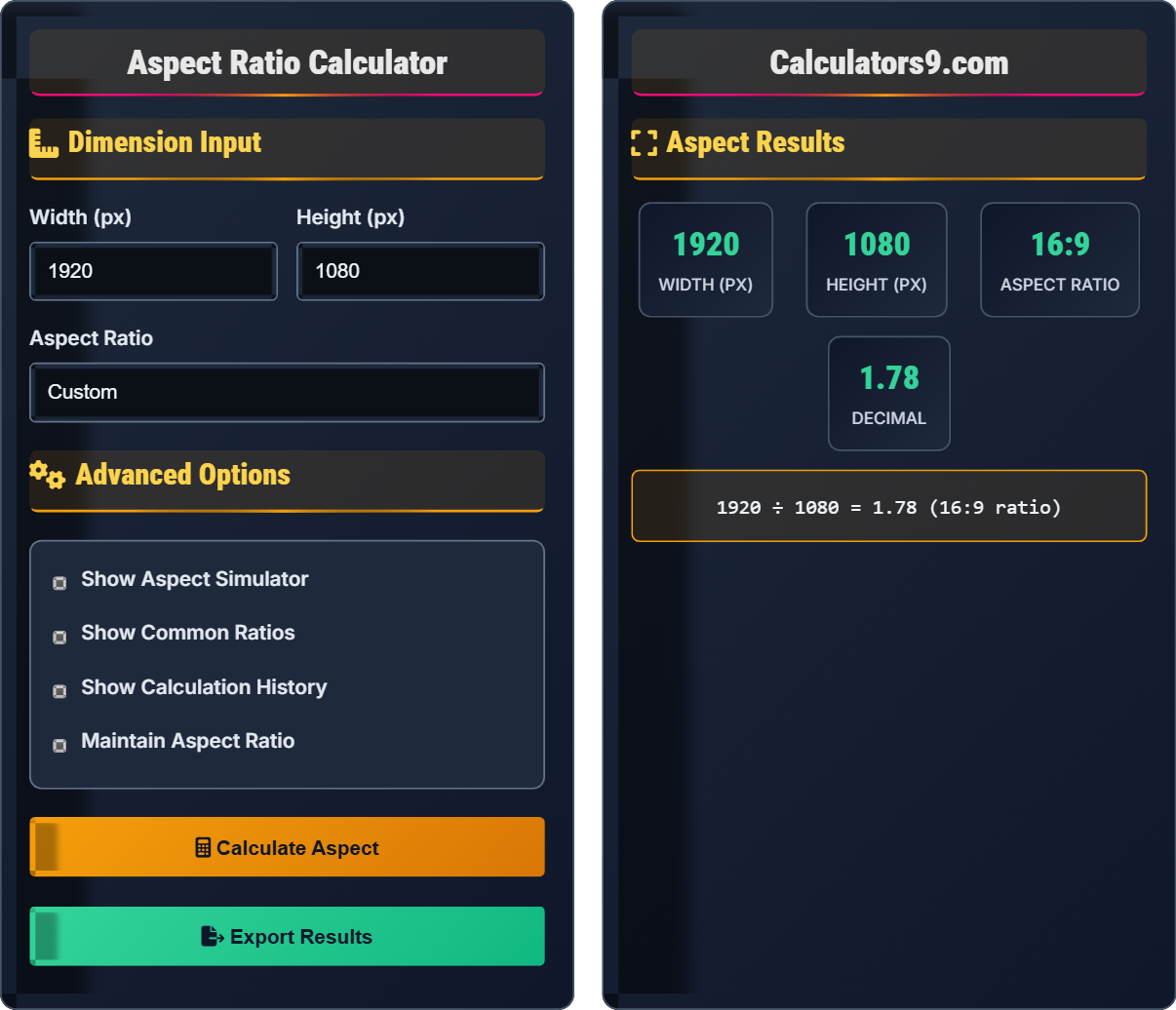
Dimension converter • 2026 responsive design
\( \text{Aspect Ratio} = \frac{\text{Width}}{\text{Height}} \)
\( \text{Width} = \text{Height} \times \text{Aspect Ratio} \)
\( \text{Height} = \frac{\text{Width}}{\text{Aspect Ratio}} \)
Where:
These formulas help maintain proportional relationships between dimensions. Aspect ratio is expressed as width:height (e.g., 16:9).
Example: For a 16:9 aspect ratio with width of 1920px:
\( \text{Height} = \frac{1920}{16/9} = \frac{1920 \times 9}{16} = 1080px \)
Thus, 1920px width at 16:9 ratio equals 1080px height.
Aspect ratio is the proportional relationship between the width and height of an image, video, or screen. It is expressed as two numbers separated by a colon (e.g., 16:9), indicating the width-to-height ratio. Understanding aspect ratios is crucial for responsive web design, ensuring content displays correctly across different devices and screen sizes.
The fundamental aspect ratio calculation is:
Where:
Choosing the right aspect ratio depends on your content and audience:
Aspect ratio is the proportional relationship between width and height dimensions.
\( \text{Aspect Ratio} = \frac{\text{Width}}{\text{Height}} \)
Where ratio=proportional relationship, width=horizontal dimension, height=vertical dimension.
Aspect ratios ensure content maintains correct proportions across different screen sizes.
What does an aspect ratio of 16:9 mean?
The answer is C) For every 16 units of width, there are 9 units of height. Aspect ratio is a proportional relationship between width and height. It doesn't specify actual measurements but rather the ratio between dimensions. So 16:9 means the width is 16/9 times the height, or approximately 1.78 times taller.
Aspect ratio is fundamentally about proportions, not absolute measurements. The notation A:B means that when the width is A units, the height is B units. This relationship remains constant regardless of the actual size. Understanding this concept is crucial for responsive design, as it helps maintain the shape of content across different screen sizes.
Aspect Ratio: Proportional relationship between width and height
Proportion: Relative size relationship between parts
Dimensions: Width and height measurements
• Aspect ratio is a proportion, not a measurement
• The ratio remains constant regardless of size
• Common notation is width:height
• Think of it as a recipe: 16 parts width to 9 parts height
• Multiply both sides by the same number to scale
• Common ratios: 16:9, 4:3, 1:1
• Confusing aspect ratio with actual measurements
• Thinking the numbers represent pixels
• Not understanding the proportional relationship
Calculate the aspect ratio of an image that is 1920 pixels wide and 1080 pixels tall. Show your work.
Using the aspect ratio formula: \( \text{Aspect Ratio} = \frac{\text{Width}}{\text{Height}} \)
Given:
Step 1: Calculate the ratio: \( \frac{1920}{1080} = 1.777... \)
Step 2: Find the greatest common divisor (GCD) of 1920 and 1080
GCD(1920, 1080) = 120
Step 3: Divide both by GCD: \( \frac{1920}{120} : \frac{1080}{120} = 16:9 \)
Therefore, the aspect ratio is 16:9.
To find the simplified aspect ratio, we divide both dimensions by their greatest common divisor (GCD). This gives us the simplest whole number ratio that represents the same proportion. The decimal 1.777... is equivalent to the fraction 16/9, which is why 1920×1080 is known as a 16:9 aspect ratio.
Greatest Common Divisor (GCD): Largest number that divides both dimensions
Simplified Ratio: Ratio expressed in lowest terms
Proportional Relationship: Unchanged relationship when scaled
• Always simplify ratios to lowest terms
• Use GCD to find simplified ratios
• The decimal value remains the same
• Use online GCD calculators for large numbers
• Common ratios: 16:9, 4:3, 1:1, 21:9
• Decimal approximation helps verify ratios
• Not simplifying to lowest terms
• Using decimal ratios instead of fractions
• Forgetting to verify the calculation
A web designer has a video player that needs to maintain a 16:9 aspect ratio. If the player width is 800px on desktop, what should the height be? If the player width shrinks to 400px on mobile, what happens to the height?
For desktop (800px width):
Using the formula: \( \text{Height} = \frac{\text{Width}}{\text{Aspect Ratio}} = \frac{\text{Width} \times 9}{16} \)
Height = \( \frac{800 \times 9}{16} = \frac{7200}{16} = 450px \)
For mobile (400px width):
Height = \( \frac{400 \times 9}{16} = \frac{3600}{16} = 225px \)
The height adjusts proportionally to maintain the 16:9 aspect ratio.
This example demonstrates how aspect ratios maintain proportional relationships during responsive design. As the width changes, the height automatically adjusts to preserve the same shape. This ensures that videos and images don't appear stretched or compressed on different screen sizes.
Responsive Design: Design that adapts to different screen sizes
Proportional Scaling: Maintaining shape during size changes
Aspect Preservation: Keeping the same width-to-height ratio
• Aspect ratio remains constant regardless of size
• Width and height change proportionally
• The ratio determines the shape
• Use CSS aspect-ratio property for easy implementation
• Plan for multiple screen sizes
• Test on actual devices
• Not maintaining aspect ratio during responsive design
• Using fixed height values
• Forgetting to account for different screen sizes
A photographer needs to resize a 24MP (6000×4000) image to fit a 1920×1080 display while maintaining the original aspect ratio. Calculate the final dimensions and determine if cropping is needed. What would be the dimensions if the image is scaled to fit within the display bounds?
Original aspect ratio: \( \frac{6000}{4000} = 1.5 \) (3:2 ratio)
Display aspect ratio: \( \frac{1920}{1080} = 1.78 \) (16:9 ratio)
Since 1.5 ≠ 1.78, the aspect ratios are different.
Scaling to fit within display (maintaining 3:2):
If width = 1920px, height = \( \frac{1920}{1.5} = 1280px \) (too tall)
If height = 1080px, width = \( 1080 \times 1.5 = 1620px \) (fits within 1920px)
Final dimensions: 1620×1080 pixels (scaled to fit height).
When dealing with different aspect ratios, you must decide whether to crop or letterbox/pillarbox. Scaling to fit within bounds means the entire image is visible but may leave empty space. The key is calculating which dimension will be the limiting factor based on the aspect ratios.
Letterboxing: Adding black bars to maintain aspect ratio
Cropping: Cutting off parts of image to fit
Fit Within: Sizing to stay within boundaries
• Calculate limiting dimension first
• Maintain original aspect ratio
• Consider content visibility needs
• Use CSS object-fit for image containers
• Consider the most important parts of the image
• Test different scaling approaches
• Stretching images to fit containers
• Not considering important image content
• Forgetting to account for different aspect ratios
Which of the following represents the best practice for aspect ratio handling in responsive web design?
The answer is B) Maintain consistent aspect ratios with CSS. This approach ensures that content maintains its intended proportions across different screen sizes while using CSS properties like aspect-ratio, object-fit, and proper scaling techniques. This creates a professional appearance and prevents distortion of images and videos.
Modern CSS provides powerful tools for maintaining aspect ratios responsively. The aspect-ratio property, combined with object-fit and responsive units, allows designers to create layouts that preserve the intended shape of content while adapting to different screen sizes. This is essential for professional web design.
Best Practice: Proven approach that achieves optimal results
Responsive Maintenance: Preserving proportions during scaling
Professional Appearance: Maintaining visual quality
• Use CSS aspect-ratio property
• Implement proper scaling techniques
• Maintain visual quality across devices
• Use CSS aspect-ratio for containers
• Apply object-fit to media elements
• Plan aspect ratios during design phase
• Not using CSS aspect ratio properties
• Allowing content to stretch and distort
• Ignoring responsive design principles
Q: How do I maintain aspect ratio in CSS without distorting images?
A: Use the CSS aspect-ratio property along with object-fit:
This ensures the container maintains the aspect ratio while the image fills the space without distortion. The object-fit: cover property maintains the aspect ratio of the image while filling the container.
Q: What's the difference between 16:9 and 4:3 aspect ratios?
A: The main differences are:
Mathematically: 16:9 = 16/9 = 1.78, while 4:3 = 4/3 = 1.33. The 16:9 format is approximately 33% wider than 4:3 for the same height.