Border Radius Creator
CSS border radius generator • Live preview
Border Radius Syntax:
Show the generatorBasic Syntax:
- border-radius: top-left top-right bottom-right bottom-left;
- Single Value: border-radius: 10px; → All corners
- Two Values: border-radius: 10px 20px; → (tl/br) (tr/bl)
- Three Values: border-radius: 10px 20px 30px; → tl (tr/bl) br
- Four Values: border-radius: 10px 20px 30px 40px; → tl tr br bl
Ellipse Syntax:
- border-radius: horizontal / vertical;
- Example: border-radius: 20px / 10px; → Elliptical corners
Border-radius creates smooth, rounded corners that enhance visual appeal and user experience.
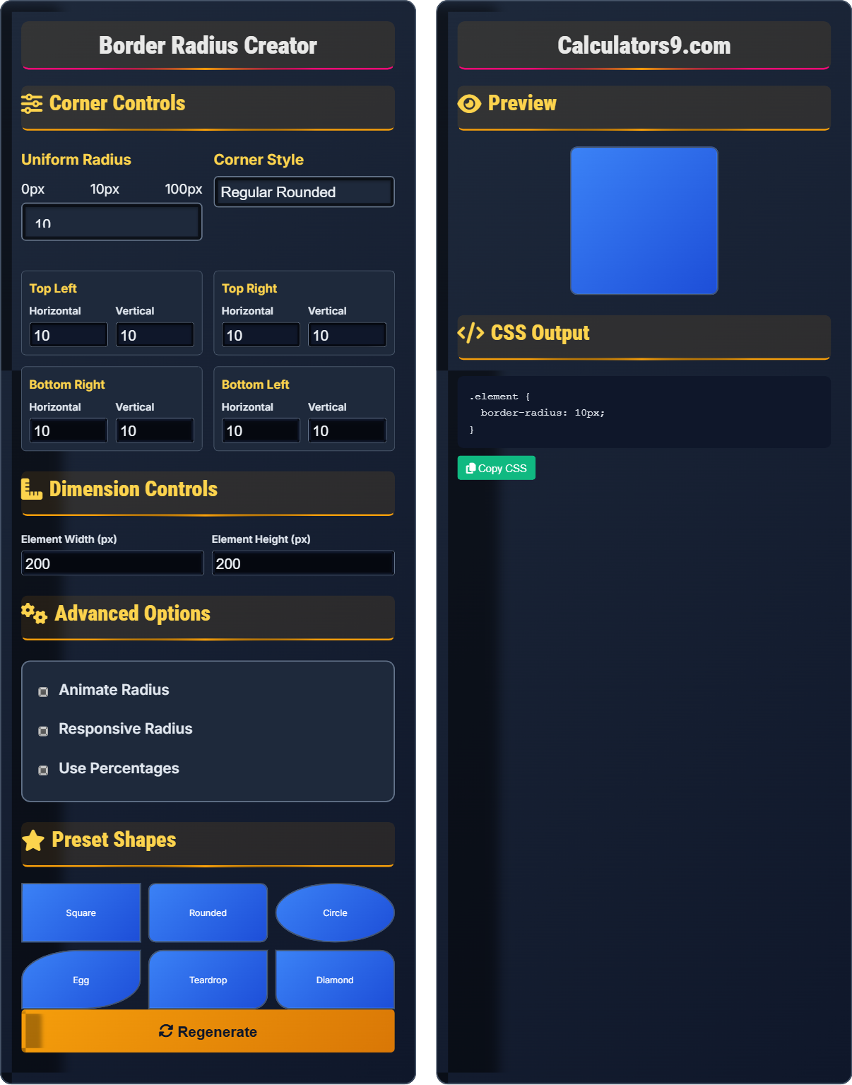
Corner Controls
Uniform Radius
Corner Style
Top Left
Top Right
Bottom Right
Bottom Left
Dimension Controls
Advanced Options
Preset Shapes
Preview
CSS Output
Comprehensive Border Radius Guide
CSS border-radius is a property that allows you to round the corners of elements. It's widely used for creating modern, soft UI elements, buttons, cards, and other design components. Unlike images, border-radius is vector-based and scales perfectly to any resolution.
Border-radius can control:
Elliptical corners → Different horizontal/vertical radii
Uniform rounding → Same radius on all corners
Asymmetric shapes → Creative corner combinations
These controls work together to create various rounded effects.
Border-radius offers several advantages:
- File Size: Zero bytes (generated by browser)
- Scalability: Perfect quality at any resolution
- Performance: Hardware-accelerated rendering
- Customization: Easy modification via CSS
- Consistency: Use uniform values throughout
- Usability: Maintain tap targets for mobile
- Accessibility: Ensure sufficient contrast
- Performance: Avoid extreme values
Border Radius Fundamentals
Values define corner rounding behavior.
border-radius: top-left top-right bottom-right bottom-left;
Example: border-radius: 10px 20px 10px 20px;
- Single value applies to all corners
- Max value is 50% of element dimension
- Can use px, %, em, rem units
- Supports elliptical values (h/v)
Development Tips
Horizontal/vertical radius for oval corners.
- Circular: border-radius: 50%
- Pill: border-radius: 50px
- Subtle: border-radius: 4-8px
- Asymmetric: different values per corner
- Consider mobile tap target sizes
- Ensure content remains accessible
- Test with different element sizes
- Use consistent values in design system
Border Radius Learning Quiz
What does the CSS property border-radius: 10px 20px 30px 40px; do?
The answer is B) Sets TL=10px, TR=20px, BR=30px, BL=40px. When four values are provided to border-radius, they follow the clockwise order: top-left, top-right, bottom-right, bottom-left. This gives complete control over each corner's radius.
Understanding the order of values in border-radius is crucial for precise corner control. The clockwise order (top-left, top-right, bottom-right, bottom-left) is consistent with other CSS properties like margin and padding. This systematic approach makes it easier to remember and apply the property correctly.
TL: Top-left corner
TR: Top-right corner
BR: Bottom-right corner
BL: Bottom-left corner
• Four values: TL TR BR BL
• Clockwise order applies
• Values can be different per corner
• Remember: Clockwise direction
• Use 0 for square corners
• Combine with transitions for animations
• Confusing the order of values
• Assuming values repeat in pairs
• Not understanding clockwise direction
How would you create a perfect circle using border-radius? Provide an example and explain why it works.
To create a perfect circle, use border-radius: 50%;
Example:
.circle {
  width: 100px;
  height: 100px;
  border-radius: 50%;
}
This works because 50% of the width/height creates a radius that extends to the center of the element, forming a perfect circle. The element must have equal width and height for a perfect circle.
The 50% value works because it represents half the element's dimension. When the radius equals half the width and half the height, the curved corners meet at the center, creating a circular shape. This principle applies to any square element, making it a reliable method for creating circles.
50% Radius: Half the element dimension
Square Element: Equal width and height
Circular Shape: Perfectly round form
• Element must be square for perfect circle
• 50% creates circular shape
• Works with any size square
• Use 50% for circular elements
• Ensure equal width/height
• Works for avatars and badges
• Applying to non-square elements
• Using fixed pixel values instead of %
• Not ensuring equal dimensions
You need to create a pill-shaped button that adapts to different text lengths. How would you implement this using border-radius to ensure the ends remain rounded regardless of the button's width?
Use a large border-radius value that exceeds the button's height:
.pill-button {
  padding: 10px 20px;
  border-radius: 50px;
  /* Or use height-based value */
  border-radius: calc(height / 2);
}
Alternatively, use a percentage value based on the element's height: border-radius: 999px; which ensures the corners are always rounded regardless of the button's dimensions.
This approach works because when the border-radius value is large enough (greater than half the element's height), the corners curve to meet in the middle, creating a pill shape. Using a very large value like 999px or 50px ensures this effect regardless of the actual dimensions.
Pill Shape: Rectangle with fully rounded ends
Adaptive Design: Responds to content changes
Large Radius: Exceeds element dimensions
• Radius > height/2 creates pill shape
• Use large values for adaptive pills
• Consider using calc() for dynamic values
• Use 999px for guaranteed pill effect
• Combine with padding for spacing
• Test with different content lengths
• Using small radius values that don't create pill shape
• Not considering variable content width
• Forgetting to adjust for element height
A border-radius that looks perfect on desktop appears too subtle on mobile devices. How would you adjust the radius to be responsive across different screen sizes?
Use media queries to adjust border-radius based on screen size:
.element {
  border-radius: 12px;
}

@media (max-width: 768px) {
  .element {
    border-radius: 16px;
  }
}

@media (max-width: 480px) {
  .element {
    border-radius: 20px;
  }
}
Alternatively, use relative units like rem or em for scalable corners.
This demonstrates the importance of responsive design for visual elements. Border-radius values that look appropriate on large screens might appear too subtle on smaller mobile screens. Using media queries or relative units ensures consistent visual appearance across all devices.
Responsive Design: Adapting to different screens
Media Queries: CSS rules for different conditions
Relative Units: Scale with context
• Consider mobile viewing distances
• Use relative units for scalability
• Test across different devices
• Use em or rem for scalable corners
• Test radius values on actual devices
• Consider accessibility implications
• Using same values across all screen sizes
• Not considering mobile usability
• Ignoring accessibility for touch targets
What does the CSS property border-radius: 20px / 10px; do?
The answer is C) Sets horizontal radius to 20px, vertical to 10px. The slash (/) in border-radius separates horizontal and vertical radius values. This creates elliptical corners where the horizontal and vertical curves can be different, allowing for more complex and creative shapes.
The slash notation in border-radius allows for elliptical corners, which is particularly useful for creating ovals, eggs, teardrops, and other organic shapes. The first value (before the slash) controls the horizontal radius, and the second value (after the slash) controls the vertical radius for each corner.
Elliptical Radius: Different horizontal/vertical curves
Slash Notation: Separates h/v values
Horizontal Radius: Curve along x-axis
Vertical Radius: Curve along y-axis
• Slash separates horizontal/vertical values
• First value = horizontal radius
• Second value = vertical radius
• Use for organic, non-circular shapes
• Creates oval/elliptical corners
• Combine with other border-radius values
• Confusing slash notation with other syntax
• Not understanding horizontal vs vertical
• Forgetting the order of values
FAQ
Q: What's the difference between border-radius and clip-path?
A: border-radius rounds the corners of an element's border and content, while clip-path can create any arbitrary shape by clipping parts of the element.
Border-radius: border-radius: 20px; → Rounds corners with circular arcs
Clip-path: clip-path: polygon(50% 0%, 0% 100%, 100% 100%); → Creates triangle shape
Use border-radius for simple rounded corners and clip-path for complex geometric shapes.
Q: How do I create different radii for horizontal and vertical corners?
A: Use the slash notation to specify horizontal and vertical radii separately:
border-radius: 20px / 10px; → 20px horizontal, 10px vertical
border-radius: 10px 20px / 5px 15px; → TL/TR BR/BL for both h/v
This creates elliptical corners where the horizontal and vertical curves differ, useful for creating ovals and other non-circular shapes.