Box Shadow Creator
CSS box shadow generator • Live preview
Box Shadow Syntax:
Show the generatorBasic Syntax:
- box-shadow: h-offset v-offset blur spread color inset;
- h-offset: Horizontal offset (positive = right, negative = left)
- v-offset: Vertical offset (positive = down, negative = up)
- blur: Blur radius (0 = sharp, higher = more blurred)
- spread: Spread distance (positive = larger, negative = smaller)
- color: Shadow color
- inset: Optional keyword for inner shadows
Multiple Shadows:
- Syntax: box-shadow: shadow1, shadow2, shadow3;
- Example: box-shadow: 0 4px 8px rgba(0,0,0,0.1), 0 2px 4px rgba(0,0,0,0.1);
Box shadows add depth and dimension to elements, enhancing visual hierarchy and user experience.
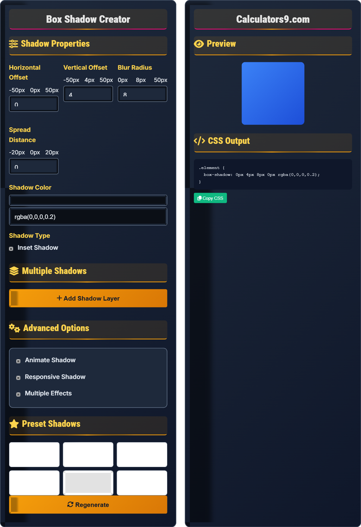
Shadow Properties
Horizontal Offset
Vertical Offset
Blur Radius
Spread Distance
Shadow Color
Shadow Type
Multiple Shadows
Advanced Options
Preset Shadows
Preview
CSS Output
Comprehensive Shadow Guide
CSS box-shadow is a property that allows you to add shadow effects to elements. Unlike images, box shadows are vector-based and scale perfectly to any resolution. They're widely used for creating depth, emphasis, and visual hierarchy in modern web design.
Box shadows consist of five main components:
Vertical Offset → Distance up/down from element
Blur Radius → Softness of shadow edges
Spread Distance → Size adjustment of shadow
Color → Appearance of shadow
These components work together to create various shadow effects.
Box shadows offer several advantages:
- File Size: Zero bytes (generated by browser)
- Scalability: Perfect quality at any resolution
- Performance: Hardware-accelerated rendering
- Customization: Easy modification via CSS
- Subtlety: Use subtle shadows for natural effects
- Performance: Avoid excessive blur values
- Accessibility: Ensure sufficient contrast
- Consistency: Maintain uniform shadow styles
Shadow Fundamentals
Five properties define box shadow appearance.
box-shadow: h-offset v-offset blur spread color;
Example: box-shadow: 0 4px 8px rgba(0,0,0,0.2);
- First two values (offsets) are required
- Color defaults to current color if omitted
- Multiple shadows separated by commas
- Can be animated with transitions
Development Tips
Colors with alpha transparency for subtle effects.
- Card shadows: 0 4px 8px rgba(0,0,0,0.1)
- Depth effects: Multiple layered shadows
- Focus states: Bright colored shadows
- Inner shadows: For pressed/inset effects
- Test performance with complex shadows
- Consider accessibility contrast
- Use consistently throughout design system
- Match shadows to light source direction
Box Shadow Learning Quiz
What does the 'blur' value in box-shadow control?
The answer is B) Softness of shadow edges. The blur value in box-shadow controls how soft or hard the edges of the shadow appear. A value of 0 creates a sharp shadow with no blur, while higher values create increasingly softer, more diffused shadows.
Understanding each component of the box-shadow property is essential for creating realistic and effective shadow effects. The blur value specifically affects the transition between the shadow and the background, simulating the natural diffusion of light and shadow in the physical world.
Blur Radius: Amount of softness in shadow edges
Sharp Shadow: 0 blur value, hard edges
Soft Shadow: Higher blur value, diffused edges
• Higher blur values create softer shadows
• 0 blur creates sharp shadow edges
• Blur cannot be negative
• Use low blur (2-4px) for subtle effects
• Higher blur (10px+) for dramatic depth
• Combine with spread for size adjustments
• Confusing blur with spread distance
• Using excessive blur values affecting performance
• Not understanding the relationship with offset
Explain the difference between outer and inner shadows, and provide examples of when to use each.
Outer Shadow: Default behavior, shadow appears outside the element.
Inner Shadow: Uses 'inset' keyword, shadow appears inside the element.
Examples:
- Outer: Card hover effects, depth creation
- Inner: Pressed buttons, inset text fields
- Outer: Drop shadows for floating elements
- Inner: Sunken panels or recessed areas
The 'inset' keyword fundamentally changes the shadow behavior from projecting away from the element to appearing as if the element is recessed into the background. This creates completely different visual effects and is useful for creating various UI states and depth perceptions.
Outer Shadow: Shadow outside element boundaries
Inner Shadow: Shadow inside element boundaries
inset Keyword: Changes shadow behavior
• inset keyword comes after other values
• Inner shadows appear as if element is recessed
• Outer shadows appear as if element floats above
• Use inner shadows for pressed button states
• Outer shadows for floating elements
• Combine both for complex effects
• Forgetting to add inset keyword
• Using wrong shadow type for intended effect
• Not understanding visual implications
You need to create a card component that appears to float above the page with a subtle shadow. The card should also have a slight glow effect when hovered. How would you implement this using CSS box shadows?
Base card shadow:
.card {
  box-shadow: 0 4px 8px rgba(0,0,0,0.1);
  transition: box-shadow 0.3s ease;
}
Hover state with glow:
.card:hover {
  box-shadow: 0 8px 16px rgba(0,0,0,0.2),
              0 0 20px rgba(0,123,255,0.3);
}
This creates a primary shadow for depth and a secondary glowing shadow on hover.
This example demonstrates how multiple shadows can be layered to create complex effects. The first shadow creates the primary depth effect, while the second creates a glowing effect. The transition property ensures smooth animation between states, enhancing user experience.
Card Component: UI element for displaying content
Multiple Shadows: Several shadows layered together
Transition: Smooth change between states
• Separate multiple shadows with commas
• Use rgba for transparency control
• Add transitions for smooth effects
• Use rgba for subtle shadows
• Layer shadows from outer to inner
• Match shadow intensity to lighting concept
• Using too many shadows creating muddy effect
• Not using transitions for hover states
• Ignoring performance impact of complex shadows
A button has a shadow effect that looks perfect on desktop but appears too intense on mobile devices. How would you adjust the shadow to be responsive across different screen sizes?
Use media queries to adjust shadow properties:
.button {
  box-shadow: 0 4px 8px rgba(0,0,0,0.2);
}

@media (max-width: 768px) {
  .button {
    box-shadow: 0 2px 4px rgba(0,0,0,0.15);
  }
}

@media (max-width: 480px) {
  .button {
    box-shadow: 0 1px 2px rgba(0,0,0,0.1);
  }
}
This progressively reduces shadow intensity on smaller screens.
This demonstrates the importance of responsive design for visual effects. Shadows that look appropriate on large screens can appear overly dramatic on smaller devices. Adjusting shadow properties based on screen size ensures consistent visual experience across all devices.
Responsive Design: Adapting layout to different screens
Media Queries: CSS rules for different conditions
Visual Hierarchy: Relative importance of elements
• Reduce shadow intensity on smaller screens
• Consider touch interface requirements
• Test across different devices
• Use relative units when possible
• Test shadows on actual devices
• Consider accessibility implications
• Not considering mobile viewing distances
• Using same shadows across all screen sizes
• Ignoring performance on mobile devices
What is the correct order of values in the box-shadow property?
The answer is B) h-offset, v-offset, blur, spread, color. The correct syntax for box-shadow is: box-shadow: h-offset v-offset blur spread color inset;. The horizontal and vertical offsets are required, while blur, spread, color, and inset are optional (with defaults).
Memorizing the correct order is important for writing valid CSS. The horizontal offset and vertical offset must come first as they are required values. Understanding this sequence helps prevent syntax errors and makes CSS more readable and maintainable.
h-offset: Horizontal distance of shadow
v-offset: Vertical distance of shadow
Required Values: Must be specified in CSS
• First two values (offsets) are required
• Order: h-offset, v-offset, blur, spread, color
• inset keyword comes last if used
• Remember: "Have Very Big Smart Cats?" (H-V-B-S-C)
• Practice with common combinations
• Use CSS validators to catch syntax errors
• Mixing up the order of values
• Forgetting that offsets are required
• Placing inset keyword in wrong position
FAQ
Q: What's the difference between box-shadow and filter: drop-shadow()?
A: box-shadow creates shadows based on the element's box model (rectangular), while filter: drop-shadow() creates shadows based on the element's actual shape including borders and clips.
Box-shadow: box-shadow: 0 4px 8px rgba(0,0,0,0.3); → Always rectangular shadow
Filter: filter: drop-shadow(0 4px 8px rgba(0,0,0,0.3)); → Follows actual shape
Use box-shadow for simple rectangular elements and filter: drop-shadow() for complex shapes like circles, clipped images, or irregular forms.
Q: How do I create a glowing effect with box-shadow?
A: Create a glowing effect by using a blur value without offset and a bright color:
box-shadow: 0 0 20px rgba(0,123,255,0.5); → Blue glow
box-shadow: 0 0 15px rgba(255,215,0,0.8); → Gold glow
For multi-colored glows, use multiple shadows:
box-shadow: 0 0 10px rgba(255,0,0,0.5), 0 0 20px rgba(0,255,0,0.3);