Clip Path Maker
CSS clip path generator • Live preview
Clip Path Syntax:
Show the generatorBasic Functions:
- circle(): circle(radius at x y)
- ellipse(): ellipse(rx ry at x y)
- polygon(): polygon(x1 y1, x2 y2, x3 y3, ...)
- inset(): inset(top right bottom left round radius)
Examples:
- Circle: clip-path: circle(50% at 50% 50%);
- Ellipse: clip-path: ellipse(50% 30% at 50% 50%);
- Polygon: clip-path: polygon(0 0, 100% 0, 50% 100%);
- Inset: clip-path: inset(10px 20px 10px 20px round 10px);
Clip-path creates complex shapes by clipping portions of an element, enabling creative designs without images.
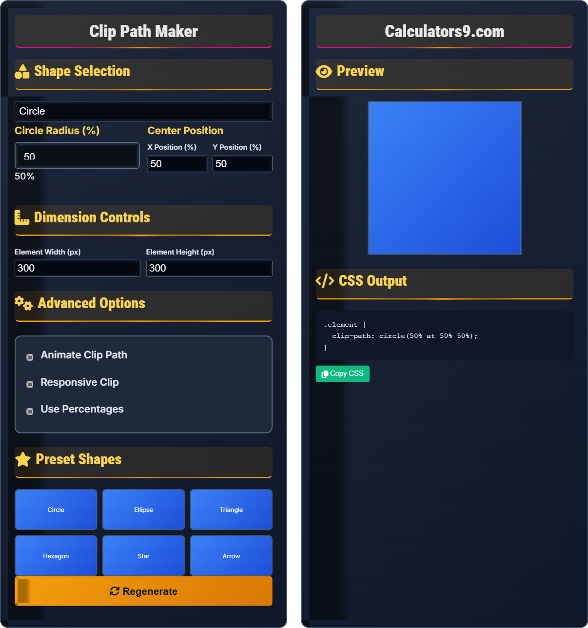
Shape Selection
Dimension Controls
Advanced Options
Preset Shapes
Preview
CSS Output
Comprehensive Clip Path Guide
CSS clip-path is a property that allows you to define which parts of an element are visible by clipping away certain portions. Unlike images, clip-path is vector-based and scales perfectly to any resolution. It's widely used for creating unique shapes and design elements in modern web design.
Clip-path supports several functions:
Ellipse → Oval clipping
Polygon → Custom multi-point shapes
Inset → Rectangle with optional rounding
These functions work together to create various clipping effects.
Clip-path offers several advantages:
- File Size: Zero bytes (generated by browser)
- Scalability: Perfect quality at any resolution
- Performance: Hardware-accelerated rendering
- Customization: Easy modification via CSS
- Performance: Complex polygons may impact performance
- Accessibility: Ensure content remains accessible
- Browser Support: Provide fallbacks for older browsers
- Responsiveness: Consider percentage values
Clip Path Fundamentals
Functions define the clipping shape.
clip-path: function(parameters);
Example: clip-path: circle(50% at 50% 50%);
- Function must be specified
- Parameters vary by function type
- Coordinates can be in px, %, em
- Can be animated with transitions
Development Tips
0,0 is top-left, 100%,100% is bottom-right.
- Circle: clip-path: circle(50%)
- Triangle: clip-path: polygon(50% 0%, 0% 100%, 100% 100%)
- Diamond: clip-path: polygon(50% 0%, 100% 50%, 50% 100%, 0% 50%)
- Parallelogram: clip-path: polygon(25% 0%, 100% 0%, 75% 100%, 0% 100%)
- Complex shapes may impact performance
- Consider accessibility implications
- Test across different browsers
- Use percentages for responsive designs
Clip Path Learning Quiz
Which CSS clip-path function would you use to create a triangular shape?
The answer is C) clip-path: polygon(). To create a triangular shape, you need to define three points using the polygon() function. For example: clip-path: polygon(50% 0%, 0% 100%, 100% 100%); creates a triangle pointing upward.
Understanding which function to use for different shapes is crucial for effective clip-path usage. The polygon() function is the most versatile as it allows you to define any shape by specifying coordinates. Circles and ellipses are limited to circular shapes, while inset creates rectangular shapes.
Polygon: Multi-sided shape defined by points
Triangular Shape: Three-sided geometric figure
Coordinate System: Positioning system for shapes
• Use polygon() for custom shapes
• Triangle needs 3 points minimum
• Points defined in clockwise order
• Use percentages for responsive shapes
• Test coordinates in small increments
• Visualize points on a grid system
• Trying to create triangles with circle/ellipse
• Incorrect point order in polygon
• Not understanding coordinate system
How would you create a circular clip path that is centered in the element? Provide an example and explain the parameters.
To create a centered circular clip path, use: clip-path: circle(50% at 50% 50%);
Explanation:
- 50%: Radius of the circle (half the element's width/height)
- at 50% 50%: Center position (middle of the element)
The circle() function accepts two sets of parameters: the radius and the center position. When both are set to 50%, the circle will be perfectly centered with a radius that extends to the middle of the element. This is the most common way to create circular clipping effects.
Radius: Distance from center to edge
Center Position: Location of circle center
50% Value: Middle of element
• Radius can be in px or %
• Use 50% for responsive circles
• Adjust radius for partial circles
• Move center position for off-center circles
• Omitting the 'at' keyword for center position
• Using incorrect coordinate order
• Not specifying both center coordinates
You need to create a diamond-shaped image container that maintains its proportions across different screen sizes. How would you implement this using CSS clip-path?
Use a polygon with percentage-based coordinates to create a responsive diamond:
.diamond-image {
  clip-path: polygon(50% 0%, 100% 50%, 50% 100%, 0% 50%);
  width: 300px;
  height: 300px;
  /* Responsive container */
  width: 100%;
  aspect-ratio: 1/1;
}
This creates a diamond shape with points at the center of each side, maintaining proportions at any size.
This approach works because percentage-based coordinates scale with the element size. The diamond shape connects the midpoints of each side of the container (50% 0% for top center, 100% 50% for right center, etc.), creating a symmetrical diamond that maintains its proportions regardless of the container size.
Diamond Shape: Rhombus with equal sides
Responsive Design: Adapts to different sizes
Percentage Coordinates: Scale with element
• Use percentages for scalable shapes
• Diamond needs 4 points
• Points connect in order
• Use aspect-ratio for square containers
• Visualize as connecting midpoints
• Test with different aspect ratios
• Using fixed pixel coordinates
• Incorrect point order
• Not maintaining aspect ratio
A clip-path that looks perfect on desktop appears distorted on mobile devices. How would you adjust the clip-path to maintain proper proportions across different screen sizes?
Use percentage-based values instead of fixed pixels:
.element {
  clip-path: polygon(0% 0%, 100% 0%, 100% 75%, 75% 75%, 75% 100%, 50% 75%, 0% 75%);
}
Additionally, use media queries for complex shapes that need adjustment:
@media (max-width: 768px) {
  .element {
    clip-path: polygon(0% 0%, 100% 0%, 100% 80%, 80% 80%, 80% 100%, 50% 80%, 0% 80%);
  }
}
This demonstrates the importance of responsive design for clip-path shapes. Fixed pixel values don't scale with different screen sizes, causing distortion. Percentage-based coordinates maintain the proportional relationship between points regardless of the element's actual size.
Responsive Design: Adapting to different screens
Percentage Values: Scale with element size
Media Queries: Device-specific adjustments
• Use % for scalable shapes
• Test on different screen sizes
• Consider aspect ratio changes
• Always use percentages for responsive shapes
• Test shapes on actual devices
• Consider using SVG for complex shapes
• Using fixed pixel values for responsive designs
• Not testing across different devices
• Ignoring aspect ratio changes
What is the correct syntax for creating a triangle using the polygon() function?
The answer is D) Both B and C are correct. Both options create triangles, just with different orientations. Option B creates a triangle pointing up (top center, bottom left, bottom right), while option C creates a triangle pointing down (top left, top right, bottom center). Both are valid triangle shapes.
There are multiple ways to create the same shape with polygon() depending on the orientation and point order. The key is understanding that each pair of coordinates represents a vertex of the shape. The order of points matters for complex shapes but multiple orders can create the same basic shape.
Polygon: Multi-sided geometric shape
Vertex: Corner point of shapeCoordinate Pair: X,Y position
• Minimum 3 points for closed shape
• Points connect in specified order
• Multiple valid configurations possible
• Visualize points on a grid
• Test different point orders
• Use online tools to visualize shapes
• Using fewer than 3 points
• Incorrect coordinate order
• Not understanding coordinate system
FAQ
Q: What's the difference between clip-path and border-radius?
A: border-radius rounds the corners of an element's border and content, while clip-path can create any arbitrary shape by clipping parts of the element.
Border-radius: border-radius: 20px; → Rounds corners with circular arcs
Clip-path: clip-path: polygon(50% 0%, 0% 100%, 100% 100%); → Creates triangle shape
Use border-radius for simple rounded corners and clip-path for complex geometric shapes.
Q: How do I create a circular clip path that's not centered?
A: Specify different center coordinates in the circle function:
clip-path: circle(30% at 20% 80%); → Circle with 30% radius positioned at 20% from left and 80% from top
clip-path: circle(50px at 100px 150px); → Circle with 50px radius at 100px,150px coordinates
The 'at' keyword specifies the center position, allowing you to place the circle anywhere within the element.