Color Contrast Checker
WCAG accessibility tool • Contrast ratio calculator
WCAG Contrast Requirements:
Show the checkerWCAG 2.1 Standards:
- AA Level: 4.5:1 for normal text, 3:1 for large text
- AAA Level: 7:1 for normal text, 4.5:1 for large text
- Large Text: 18pt (24px) or 14pt (18.66px) bold
Contrast Calculation:
Contrast Ratio = (L1 + 0.05) / (L2 + 0.05)
Where L1 = brighter color luminance
L2 = darker color luminance
Color contrast ensures text readability for users with visual impairments.
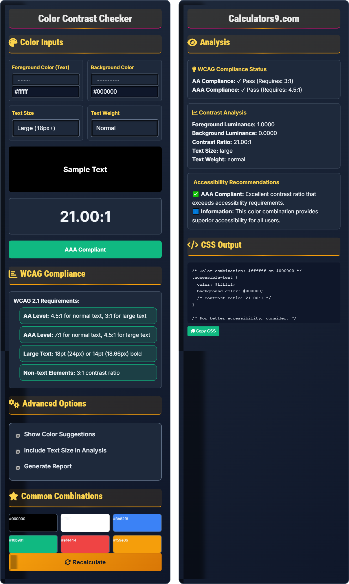
Color Inputs
Foreground Color (Text)
Background Color
Text Size
Text Weight
WCAG Compliance
WCAG 2.1 Requirements:
- AA Level: 4.5:1 for normal text, 3:1 for large text
- AAA Level: 7:1 for normal text, 4.5:1 for large text
- Large Text: 18pt (24px) or 14pt (18.66px) bold
- Non-text Elements: 3:1 contrast ratio
Advanced Options
Common Combinations
Analysis
WCAG Compliance Status
Contrast Analysis
Accessibility Recommendations
CSS Output
Comprehensive Accessibility Guide
Color contrast is the difference in luminance between foreground and background colors. It's essential for readability and accessibility, ensuring that text is perceivable by users with visual impairments, including those with color vision deficiencies.
Contrast ratio is calculated using luminance values:
Contrast → (L1 + 0.05) / (L2 + 0.05)
L1 = brighter color luminance
L2 = darker color luminance
Higher ratios indicate better contrast.
Good color contrast provides several advantages:
- Readability: Improved text comprehension
- Accessibility: Usable by people with disabilities
- Inclusivity: Wider audience reach
- Compliance: Meets legal requirements
- Text: Maintain 4.5:1 minimum
- Large Text: 3:1 minimum acceptable
- Interactive Elements: 3:1 minimum
- Testing: Verify with actual users
Contrast Fundamentals
R = sRGB red value (0-1), G = green, B = blue
Luminance = 0.2126 * R + 0.7152 * G + 0.0722 * B
R/G/B adjusted: if val ≤ 0.03928 then val/12.92 else ((val+0.055)/1.055)^2.4
Contrast Ratio = (L1 + 0.05) / (L2 + 0.05)
- Always test with actual colors
- Consider text size in analysis
- Verify with users who have visual impairments
- Meet minimum WCAG requirements
Development Tips
Approximately 8% of men and 0.5% of women have color vision deficiencies.
- Use automated tools like this checker
- Simulate color blindness with tools
- Test with real users
- Verify on different devices
- Test on various devices and lighting conditions
- Consider aging populations
- Account for screen quality variations
- Provide alternative indicators beyond color
Accessibility Learning Quiz
According to WCAG 2.1, what is the minimum contrast ratio required for normal-sized text (16px) to meet AA compliance?
The answer is B) 4.5:1. According to WCAG 2.1, the minimum contrast ratio for normal-sized text (less than 18pt or 24px) is 4.5:1 for AA compliance. This ensures that text is readable for users with mild visual impairments.
Understanding WCAG standards is crucial for creating accessible web content. The 4.5:1 ratio is based on research showing that this level of contrast allows people with moderately low vision to read text. The standards differentiate between normal and large text because larger text is inherently more readable.
WCAG: Web Content Accessibility Guidelines
AA Compliance: Level of accessibility standard
Contrast Ratio: Difference between colors
• Normal text: 4.5:1 for AA
• Large text: 3:1 for AA
• AAA requires higher ratios
• Use dark text on light backgrounds
• Test with actual color combinations
• Consider aging populations
• Confusing normal vs large text requirements
• Not testing actual color combinations
• Ignoring color vision deficiencies
How is the contrast ratio calculated between two colors, and what does the resulting number represent?
Contrast ratio is calculated using the formula: (L1 + 0.05) / (L2 + 0.05)
- L1 = luminance of the lighter color
- L2 = luminance of the darker color
- Luminance = 0.2126*R + 0.7152*G + 0.0722*B (with gamma correction)
The contrast ratio calculation takes into account human perception of brightness. The formula uses weighted values for red, green, and blue components because the human eye is more sensitive to green light. The addition of 0.05 prevents division by zero and accounts for viewing conditions.
Luminance: Perceived brightness of color
Gamma Correction: Adjustment for human perception
Contrast Ratio: Brightness difference measure
• Always use luminance values
• Account for gamma correction
• Higher ratios = better contrast
• Use tools to calculate automatically
• Test with actual color values
• Consider perceptual differences
• Using raw RGB values without luminance conversion
• Forgetting gamma correction
• Not accounting for viewing conditions
You're designing a website for a healthcare provider. The brand colors are light blue (#ADD8E6) for the background and dark gray (#333333) for text. Is this combination accessible according to WCAG standards? If not, what alternatives would you suggest?
Let's calculate the contrast ratio:
- Light blue (#ADD8E6) luminance ≈ 0.82
- Dark gray (#333333) luminance ≈ 0.10
- Contrast ratio = (0.82 + 0.05) / (0.10 + 0.05) = 0.87 / 0.15 = 5.8:1
This example demonstrates the importance of verifying brand colors against accessibility standards. Healthcare websites especially need to ensure accessibility for all users. The calculation shows that while the combination meets minimum requirements, there's room for improvement to achieve enhanced accessibility.
Healthcare Accessibility: Critical for patient safety
Brand Compliance: Meeting standards within brand constraints
Enhanced Accessibility: AAA level compliance
• Always verify brand colors
• Test brand colors early in design
• Consider accessibility when choosing brand colors
• Provide alternatives for critical information
• Assuming brand colors are accessible
• Not considering critical content requirements
• Using only color for information
A design passes the standard contrast check but may not be accessible to users with color vision deficiency. How would you ensure the design remains accessible for users with different types of color blindness?
Ensure accessibility for color-blind users by:
- Not relying solely on color to convey information
- Using text labels in addition to color-coded elements
- Providing alternative visual indicators (patterns, textures, shapes)
- Testing with color blindness simulation tools
- Ensuring sufficient luminance contrast (not just color contrast)
For example, use both color and text labels for form validation: "Password must be at least 8 characters" in red text, with an icon indicating error status.
Color vision deficiency affects about 8% of men and 0.5% of women. The most common types are deuteranopia (green deficiency) and protanopia (red deficiency). Designing for these users requires thinking beyond color alone and providing multiple channels of information.
Color Vision Deficiency: Reduced ability to see colors
Deuteranopia: Green color blindness
Protanopia: Red color blindness
• Don't rely on color alone
• Provide multiple information channels
• Test with simulation tools
• Use patterns alongside colors
• Add text labels to color indicators
• Test with color blindness simulators
• Using only color to convey information
• Not testing with color blindness tools
• Assuming all users see colors the same way
According to WCAG 2.1, what defines "large text" for contrast ratio requirements?
The answer is B) 18pt (24px) or 14pt (18.66px) bold. According to WCAG 2.1, large text is defined as either 18pt (24px) or larger, or 14pt (18.66px) or larger when bold. Bold text is considered easier to read, so the size requirement is slightly lower.
WCAG recognizes that larger text is inherently more readable, so the contrast requirements are less stringent for large text. The bold text exception acknowledges that increased weight improves readability, allowing for slightly lower contrast ratios. This creates a more practical approach to accessibility.
Large Text: 18pt (24px) or 14pt (18.66px) bold
Bold Text: Increased weight for readability
Practical Standards: Balanced accessibility requirements
• Large text: 18pt/24px minimum
• Bold text: 14pt/18.66px minimum
• Lower contrast requirement for large text
• Remember the bold text exception
• Use px equivalents for pt values
• Consider actual rendered size
• Forgetting the bold text exception
• Using only one size threshold
• Not understanding px/pt conversions
FAQ
Q: What's the difference between WCAG AA and AAA compliance?
A: WCAG AA is the minimum acceptable standard for most websites, while AAA represents enhanced accessibility.
AA Level: 4.5:1 for normal text, 3:1 for large text
AAA Level: 7:1 for normal text, 4.5:1 for large text
AAA compliance provides better accessibility for users with more severe visual impairments but may be difficult to achieve with certain brand colors. AA is generally considered the standard for most web content.
Q: How do I programmatically check color contrast in my CSS?
A: You can calculate contrast ratios in JavaScript:
function getLuminance(rgb) { /* convert RGB to luminance */ }
function contrastRatio(color1, color2) { /* calculate ratio */ }
// Then compare against WCAG thresholds
Alternatively, use libraries like axe-core or pa11y for automated accessibility testing, or tools like this calculator during development.