CSS Filter Editor
CSS filter generator • Live preview
CSS Filter Functions:
Show the generatorBasic Functions:
- blur(): Adds Gaussian blur to element
- brightness(): Adjusts brightness level
- contrast(): Adjusts contrast level
- grayscale(): Converts to grayscale
- hue-rotate(): Rotates hue in color space
- invert(): Inverts colors
- opacity(): Adjusts opacity
- saturate(): Adjusts saturation
- sepia(): Applies sepia effect
Syntax:
- Single: filter: blur(5px);
- Multiple: filter: blur(2px) brightness(1.5) contrast(200%);
- Units: px for blur, % for brightness/contrast, deg for hue-rotate
CSS filters provide powerful image manipulation capabilities without external tools or libraries.
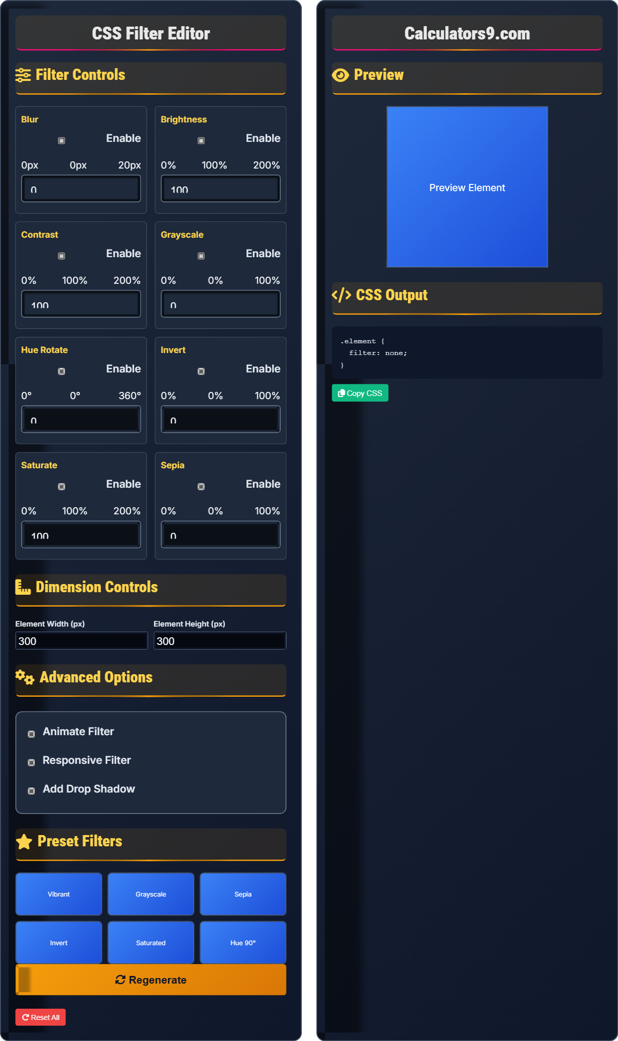
Filter Controls
Blur
Brightness
Contrast
Grayscale
Hue Rotate
Invert
Saturate
Sepia
Dimension Controls
Advanced Options
Preset Filters
Preview
CSS Output
Comprehensive CSS Filter Guide
CSS filters are visual effects that can be applied to elements to modify their appearance. They allow you to apply effects like blurring, changing brightness, contrast, saturation, and more without external tools or image editing software. These filters are hardware-accelerated in modern browsers.
CSS filters support several functions:
Brightness → Adjusts brightness level
Contrast → Adjusts contrast level
Grayscale → Converts to grayscale
Hue Rotate → Rotates hue in color space
These functions can be combined for complex effects.
CSS filters offer several advantages:
- File Size: Zero bytes (applied by browser)
- Scalability: Perfect quality at any resolution
- Performance: Hardware-accelerated rendering
- Customization: Real-time modification
- Performance: Complex filters may impact performance
- Accessibility: Ensure content remains readable
- Browser Support: Provide fallbacks for older browsers
- Subtlety: Use effects judiciously
Filter Fundamentals
Functions modify element appearance.
filter: function(parameters);
Example: filter: blur(5px) brightness(1.2);
- Multiple filters can be combined
- Filters apply to entire element
- Units vary by function type
- Can be animated with transitions
Development Tips
Complex filters may impact rendering performance.
- Vibrant: brightness(1.1) contrast(1.1)
- Dark mode: invert(1) hue-rotate(180deg)
- Frosted glass: blur(5px) saturate(1.2)
- Old photo: sepia(100%) contrast(1.2)
- Test performance with complex filters
- Consider accessibility implications
- Provide fallbacks for older browsers
- Use transitions for smooth effects
CSS Filter Learning Quiz
Which CSS filter function would you use to make an image appear black and white?
The answer is C) filter: grayscale(100%). The grayscale() function converts the colors in an element to shades of gray. A value of 100% means completely desaturated (black and white), while 0% means no change from the original colors.
Understanding each filter function's purpose is crucial for effective use. The grayscale function specifically removes color saturation, leaving only luminance values. This is different from invert() which reverses all colors, or brightness/contrast which only affects lightness/darkness.
Grayscale: Black and white version of image
Saturation: Intensity of colors
Luminance: Brightness of colors
• grayscale(100%) = completely black and white
• grayscale(0%) = no change
• Values between 0-100% partially desaturate
• Use 100% for complete grayscale
• Values 0-100% for partial effect
• Combine with other filters for complex effects
• Confusing grayscale with brightness
• Using contrast instead of saturation
• Not understanding the 0-100% range
How would you create a frosted glass effect using CSS filters? Provide an example and explain the combination.
To create a frosted glass effect, combine blur with slight saturation:
.frosted-glass {
  filter: blur(10px) saturate(1.2);
  backdrop-filter: blur(10px);
}
The blur() function creates the soft, translucent appearance, while saturate() slightly enhances colors to maintain vibrancy. backdrop-filter applies the effect to the background behind the element.
The frosted glass effect combines multiple filters to simulate the appearance of translucent materials. The blur creates the softening effect, while adjusting saturation helps maintain color vibrancy that might otherwise be dulled by the blur.
Frosted Glass: Translucent material effect
backdrop-filter: Filters background behind element
Translucency: Semi-transparent appearance
• Use blur for softening effect
• Adjust saturation to maintain colors
• backdrop-filter for background effects
• Use 5-15px blur for frosted effect
• Slightly increase saturation (1.1-1.3)
• Combine with opacity for transparency
• Using too much blur making content unreadable
• Not adjusting saturation losing vibrancy
• Forgetting backdrop-filter for background effects
You need to create an image gallery where images appear slightly enhanced on hover (more vibrant and sharp). How would you implement this using CSS filters?
Apply a subtle filter combination with smooth transition:
.gallery-image {
  filter: brightness(1.05) contrast(1.05) saturate(1.1);
  transition: filter 0.3s ease;
}

.gallery-image:hover {
  filter: brightness(1.2) contrast(1.1) saturate(1.3);
}
This creates a subtle enhancement effect that makes images appear more vibrant on hover with smooth animation.
This approach works by applying a subtle enhancement by default and a stronger enhancement on hover. The transition property ensures smooth animation between states. The combination of brightness, contrast, and saturation creates a more vibrant appearance without being too dramatic.
Enhancement: Improving visual appearance
Hover State: Interaction on mouse over
Subtle Effect: Gentle visual improvement
• Use transitions for smooth effects
• Subtle changes are more effective
• Combine multiple filters for rich effects
• Keep changes subtle (1.1-1.3 range)
• Use 0.3s for smooth transitions
• Test with different images
• Using too dramatic changes
• Not including transitions
• Not testing with various content
Applying complex filters to many elements causes performance issues. How would you optimize the filter application to maintain visual quality while improving performance?
Optimize performance using these strategies:
.optimized-element {
  /* Use GPU acceleration */
  will-change: filter;
  /* Or force hardware acceleration */
  transform: translateZ(0);
  /* Use simpler filters where possible */
  filter: blur(3px) brightness(1.1);
}
Additional optimizations:
- Limit filter complexity (avoid multiple high-blur filters)
- Apply filters to fewer elements
- Use CSS containment where appropriate
- Consider using simpler alternatives like opacity
Performance optimization for filters involves understanding that complex filters are computationally expensive. Hardware acceleration helps, but the best approach is to use simpler filters when possible or limit the number of elements affected.
GPU Acceleration: Hardware processing
will-change: Hint for browser optimization
Performance: Rendering efficiency
• Complex filters impact performance
• Use hardware acceleration when needed
• Simplify when possible
• Limit blur radius (keep under 10px)
• Use will-change sparingly
• Test performance on target devices
• Using multiple high-blur filters
• Not testing on mobile devices
• Applying to too many elements
What is the correct way to apply multiple filters to an element?
The answer is B) filter: blur(5px) brightness(1.2);. Multiple filters are applied by listing them in a single filter property, separated by spaces. The filters are applied in the order they are listed, with each subsequent filter applied to the result of the previous ones.
Understanding the syntax for multiple filters is crucial. The filter property accepts multiple functions in a single declaration, separated by spaces. The order matters as each filter modifies the result of the previous one, potentially creating different effects depending on the sequence.
Filter Chain: Sequential application of filters
Order Matters: Filters applied sequentially
Single Property: All filters in one declaration
• All filters in single property
• Separated by spaces
• Applied in listed order
• Order affects final result
• Test different sequences
• Use parentheses for clarity
• Using multiple filter properties
• Not understanding sequential application
• Confusing with other CSS properties
FAQ
Q: What's the difference between filter and backdrop-filter?
A: filter applies effects to the element itself, while backdrop-filter applies effects to the background behind the element.
Filter: filter: blur(5px); → Blurs the element content
Backdrop-filter: backdrop-filter: blur(5px); → Blurs the content behind the element
Backdrop-filter is perfect for creating frosted glass effects where the element itself remains clear but the background appears blurred.
Q: How do I animate CSS filters smoothly?
A: Use CSS transitions to animate filter changes:
.element { filter: brightness(1); transition: filter 0.3s ease; }
.element:hover { filter: brightness(1.2); }
For complex animations, use CSS keyframes with the filter property. Note that complex filters like blur() may cause performance issues during animation.