Flexbox Generator
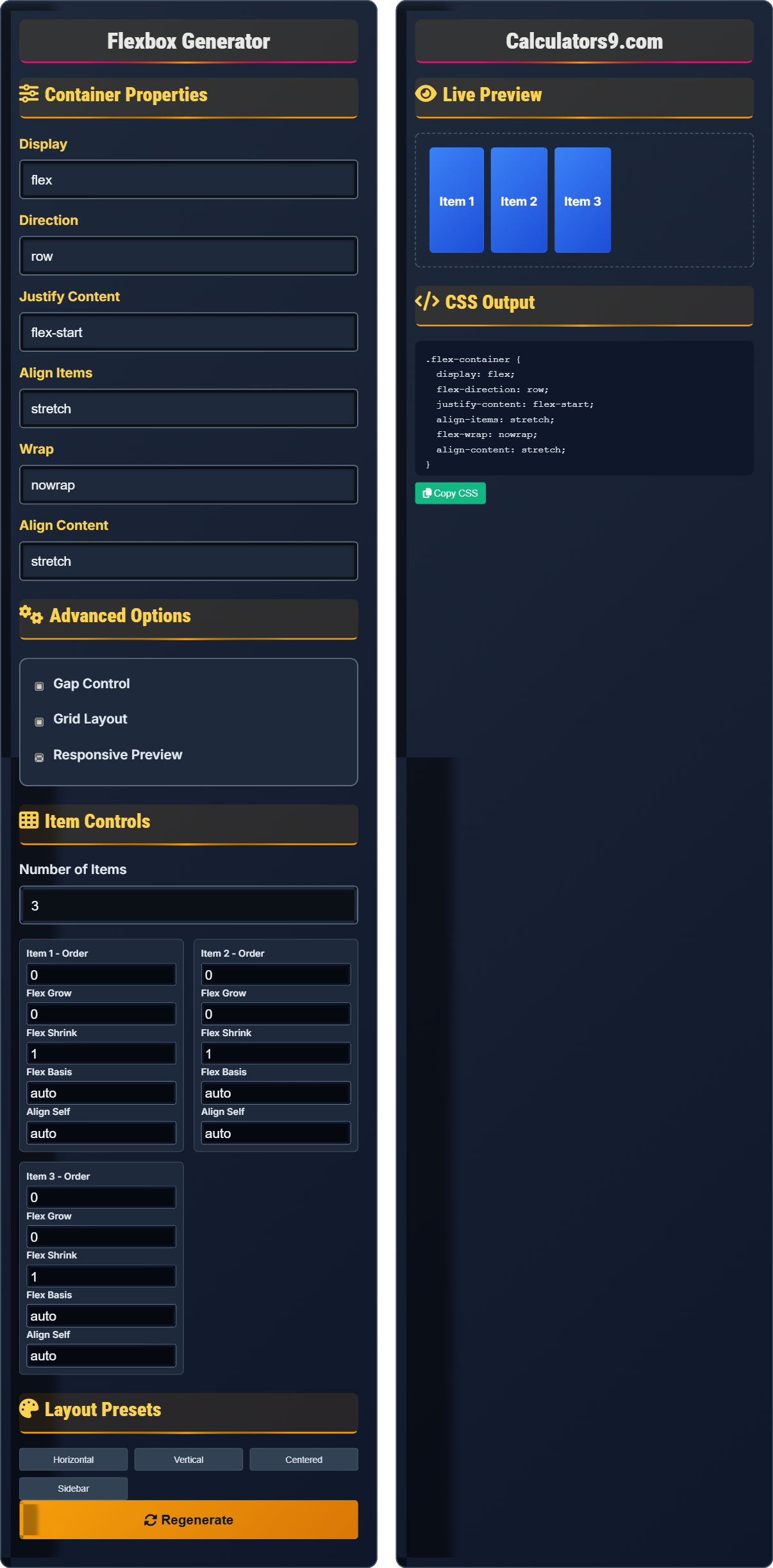
CSS flexbox layout builder • Live preview
Flexbox Properties:
Show the generatorMain Container Properties:
- display: flex | inline-flex
- flex-direction: row | row-reverse | column | column-reverse
- justify-content: flex-start | flex-end | center | space-between | space-around | space-evenly
- align-items: stretch | flex-start | flex-end | center | baseline
- flex-wrap: nowrap | wrap | wrap-reverse
- align-content: flex-start | flex-end | center | space-between | space-around | stretch
Item-Specific Properties:
- order: integer (default 0)
- flex-grow: number (default 0)
- flex-shrink: number (default 1)
- flex-basis: length | auto (default auto)
- align-self: auto | flex-start | flex-end | center | baseline | stretch
Flexbox creates efficient layouts with minimal code. The flex container distributes space among its children using flexible units, making responsive design easier.
Container Properties
Display
Direction
Justify Content
Align Items
Wrap
Align Content
Advanced Options
Item Controls
Layout Presets
Live Preview
CSS Output
Comprehensive Flexbox Guide
Flexbox (Flexible Box Layout) is a CSS layout model designed for one-dimensional layouts, either as rows or columns. It allows containers and their children to be sized and aligned flexibly, making it ideal for responsive design and component-based layouts.
Flexbox properties are categorized into container properties (applied to the parent element) and item properties (applied to child elements):
Item Properties → Child Elements
This separation allows for precise control over both the layout container and individual items within it.
The flex shorthand property combines flex-grow, flex-shrink, and flex-basis:
- flex: 1 = flex-grow: 1, flex-shrink: 1, flex-basis: 0%
- flex: 0 1 auto = don't grow, shrink if needed, use content size
- flex: none = don't grow, don't shrink, use content size
- Use for one-dimensional layouts: Either rows or columns
- Combine with Grid: Grid for overall page layout, Flexbox for components
- Consider fallbacks: For older browser support
- Test responsiveness: Ensure layouts work across devices
Flexbox Fundamentals
Parent element with display: flex that contains flex items.
.container { display: flex; }
All direct children become flex items.
- Flexbox affects direct children only
- Default direction is row (left to right)
- Items align along main and cross axes
- Flexible sizing replaces fixed dimensions
Development Tips
Properties applied to child elements within flex container.
- Equal-width columns: flex: 1
- Auto-sized content: flex: none
- Flexible items: flex: 1 1 auto
- Fixed-size items: flex: 0 0 [width]
- Nested flex containers create complex layouts
- Flexbox doesn't handle multi-dimensional layouts
- Consider performance with many flex items
- Test across different screen sizes
Flexbox Learning Quiz
What happens when you set flex-direction to 'column' on a flex container?
The answer is B) Items stack vertically from top to bottom. When flex-direction is set to 'column', the main axis becomes vertical, causing flex items to stack in a vertical column from top to bottom. This changes the default horizontal flow of flex items to a vertical flow.
Understanding flex-direction is crucial because it defines the primary axis along which flex items are laid out. The default value 'row' creates a horizontal layout, while 'column' creates a vertical layout. This property fundamentally changes how other flex properties like justify-content and align-items behave, as they now operate along the new main and cross axes.
Flex Direction: Defines the main axis of a flex container
Main Axis: Primary direction along which items flow
Cross Axis: Perpendicular to the main axis
• flex-direction: row → horizontal layout
• flex-direction: column → vertical layout
• Changes the orientation of the flex container
• Remember: row = horizontal, column = vertical
• The main axis direction affects justify-content behavior
• Cross axis direction affects align-items behavior
• Confusing main axis with cross axis directions
• Expecting justify-content to work the same way in column layout
• Not understanding how it affects other flex properties
Explain the difference between justify-content and align-items in flexbox, and provide examples of when to use each.
Justify-content: Aligns items along the main axis (direction of flex-flow). Used for distributing space between or around items.
Align-items: Aligns items along the cross axis (perpendicular to flex-flow). Used for aligning items within their container.
Examples:
- justify-content: center → centers items horizontally in row layout
- align-items: center → centers items vertically in row layout
- justify-content: space-between → distributes items evenly with first at start, last at end
- align-items: stretch → stretches items to fill container height
These two properties control alignment along different axes, which is fundamental to understanding flexbox. Justify-content works along the main axis (the direction items flow), while align-items works along the cross axis (perpendicular to the flow). This dual-axis approach allows for precise control over item positioning in both dimensions simultaneously.
Main Axis: Direction of flex-direction property
Cross Axis: Perpendicular to main axis
Alignment: Positioning of items within container
• justify-content affects main axis alignment
• align-items affects cross axis alignment
• Both work together for complete alignment control
• Think: "justify" = main axis, "align" = cross axis
• In row layout: justify = horizontal, align = vertical
• In column layout: justify = vertical, align = horizontal
• Using justify-content when you need align-items
• Not understanding axis differences in row vs column layouts
• Confusing which property controls which direction
You need to create a navigation bar with 5 equally spaced items that should take up the full width of the container and be centered vertically. How would you achieve this using flexbox properties?
To create this navigation bar:
Container CSS:
- display: flex
- justify-content: space-between (for equal spacing)
- align-items: center (to center vertically)
- height: [desired height] (for vertical centering)
Alternative for equal-width items:
- justify-content: space-around (for more even spacing)
- Or use flex: 1 on each item for equal widths
This example demonstrates how multiple flexbox properties work together to achieve a specific layout goal. The combination of justify-content for horizontal distribution and align-items for vertical alignment creates the desired navigation bar. The space-between value ensures items are distributed evenly across the available space while maintaining equal spacing between them.
Navigation Bar: Horizontal menu of links or items
Equal Spacing: Consistent gaps between items
Vertical Centering: Aligning items in middle of container height
• Use justify-content for horizontal distribution
• Use align-items for vertical alignment
• Combine properties for complete control
• space-between gives even spacing between items
• align-items: center handles vertical centering
• flex: 1 on items makes them equal width
• Using float or positioning instead of flexbox
• Not setting container height for vertical centering
• Confusing space-between with space-around
A card layout needs to switch from horizontal (on desktop) to vertical (on mobile) while maintaining centered content. How would you implement this using flexbox with media queries?
Desktop (horizontal):
- flex-direction: row
- align-items: center (to center content vertically)
Mobile (vertical):
- flex-direction: column
- align-items: center (to center content horizontally)
Media query example:
.card {
  display: flex;
  flex-direction: row;
  align-items: center;
}

@media (max-width: 768px) {
  .card {
    flex-direction: column;
  }
}
This demonstrates the power of flexbox for responsive design. By changing flex-direction, we can completely alter the layout while maintaining the same alignment properties. The role of justify-content and align-items changes based on the flex-direction, allowing for consistent centering behavior in both orientations.
Responsive Design: Adapting layout to different screen sizes
Media Queries: CSS rules for different device characteristics
Card Layout: Component with image, text, and action areas
• flex-direction controls layout orientation
• align-items maintains centering across orientations
• Media queries enable responsive behavior
• Change flex-direction in media queries
• align-items often works for centering in both orientations
• Test layouts at different breakpoints
• Not adjusting alignment properties for different orientations
• Using separate classes instead of media queries
• Forgetting to test responsive behavior
What does the CSS rule 'flex: 1' expand to?
The answer is A) flex-grow: 1, flex-shrink: 1, flex-basis: 0%. When only one value is provided to the flex shorthand, it's assigned to flex-grow, while flex-shrink defaults to 1 and flex-basis defaults to 0%. So flex: 1 is equivalent to flex: 1 1 0%, which allows the item to grow and shrink equally with a basis of 0%.
Understanding the flex shorthand is important because it's commonly used and can be confusing. The shorthand follows the order: flex-grow flex-shrink flex-basis. When fewer values are provided, defaults are applied. This shorthand is particularly useful for creating equal-width flexible items in layouts.
Flex Shorthand: Combined property for flex-grow, flex-shrink, and flex-basis
Flex Grow: Ability to grow beyond natural size
Flex Shrink: Ability to shrink below natural size
• flex: 1 → grows and shrinks equally
• flex: none → neither grows nor shrinks
• Order: grow, shrink, basis
• flex: 1 makes items equal width/height
• flex: 0 0 [size] fixes dimensions
• Remember: grow, shrink, basis order
• Confusing the order of flex shorthand values
• Not understanding default values when not specified
• Using flex: 1 when you want fixed sizes
FAQ
Q: When should I use Flexbox vs CSS Grid?
A: Use Flexbox for one-dimensional layouts (either rows or columns) and CSS Grid for two-dimensional layouts (rows AND columns).
Flexbox is ideal for:
- Navigation bars
- Card components
- Centering elements
- Equal-height columns
- Overall page layouts
- Complex multi-column designs
- Overlapping elements
Q: How does flex-basis work in relation to flex-grow and flex-shrink?
A: The flex properties work together in this way:
flex-basis: Initial size of the item before growing/shrinking
flex-grow: How much the item grows if there's extra space
flex-shrink: How much the item shrinks if there's not enough space
For example: flex: 1 1 200px means "start at 200px, grow equally with other items, and shrink equally if needed." The flex-basis establishes the starting point, then grow/shrink adjust based on available space.