Font Pairing Chooser
Typography pairing tool • Live preview
Font Pairing Principles:
Show the generatorKey Principles:
- Contrast: Different weights/styles for hierarchy
- Harmony: Complementary visual characteristics
- Readability: Legible at various sizes
- Brand Consistency: Align with brand identity
Common Pairings:
- Headline + Body: Sans-serif + Serif
- Modern: Montserrat + Open Sans
- Professional: Roboto + Lora
- Creative: Playfair Display + Raleway
Effective font pairing creates visual hierarchy and enhances readability.
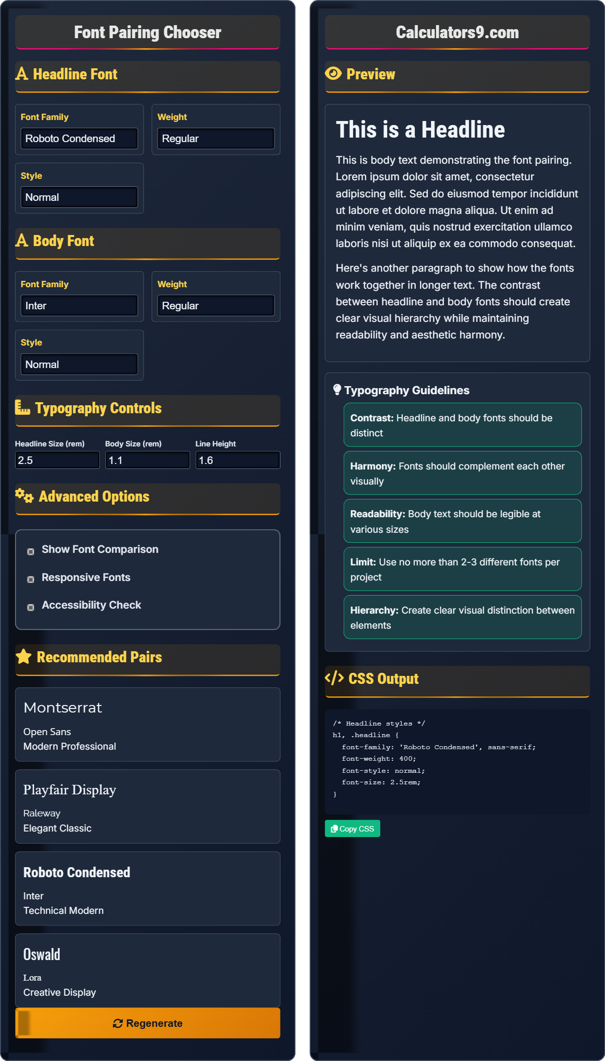
Headline Font
Font Family
Weight
Style
Body Font
Font Family
Weight
Style
Typography Controls
Advanced Options
Recommended Pairs
Preview
This is a Headline
This is body text demonstrating the font pairing. Lorem ipsum dolor sit amet, consectetur adipiscing elit. Sed do eiusmod tempor incididunt ut labore et dolore magna aliqua. Ut enim ad minim veniam, quis nostrud exercitation ullamco laboris nisi ut aliquip ex ea commodo consequat.
Here's another paragraph to show how the fonts work together in longer text. The contrast between headline and body fonts should create clear visual hierarchy while maintaining readability and aesthetic harmony.
Typography Guidelines
- Contrast: Headline and body fonts should be distinct
- Harmony: Fonts should complement each other visually
- Readability: Body text should be legible at various sizes
- Limit: Use no more than 2-3 different fonts per project
- Hierarchy: Create clear visual distinction between elements
CSS Output
Comprehensive Typography Guide
Font pairing is the practice of combining two or more fonts in a design to create visual hierarchy and enhance readability. Good font pairing creates contrast between different text elements while maintaining harmony and consistency throughout the design.
Effective font pairing follows several principles:
Harmony → Complementary visual characteristics
Readability → Legible at various sizes
Consistency → Align with brand identity
These principles work together to create effective typography.
Good font pairing offers several advantages:
- Readability: Improved text comprehension
- Hierarchy: Clear content organization
- Branding: Consistent visual identity
- User Experience: Enhanced readability and engagement
- Limited Fonts: Use no more than 2-3 fonts per project
- Contrast: Ensure sufficient difference between elements
- Accessibility: Maintain readable font sizes
- Performance: Optimize font loading
Typography Fundamentals
Serif, sans-serif, display, and script fonts.
h1 { font-family: 'Headline Font', sans-serif; }
p { font-family: 'Body Font', serif; }
Example: h1 { font-family: 'Montserrat', sans-serif; }
- Headlines need contrast with body text
- Body fonts should prioritize readability
- Limit font variety in projects
- Consider font loading performance
Development Tips
Optimize fonts for web performance.
- Use font-display: swap;
- Subset fonts for language support
- Preload critical fonts
- Provide fallback fonts
- Test readability on different devices
- Consider accessibility requirements
- Optimize font loading performance
- Ensure brand consistency
Typography Learning Quiz
What is the primary purpose of font pairing in design?
The answer is B) To create visual hierarchy and enhance readability. Font pairing is the practice of combining different fonts to establish a clear visual structure in design. The primary goal is to create contrast between different text elements while maintaining harmony and improving the overall reading experience.
Understanding the purpose of font pairing is fundamental to effective typography. Good font pairing creates a visual hierarchy that guides readers through content while maintaining readability. The contrast between headline and body fonts helps users quickly identify different content sections and navigate the information effectively.
Font Pairing: Combining different fonts for visual effect
Visual Hierarchy: Arrangement of elements by importance
Readability: Ease of reading and comprehension
• Purpose is to improve communication
• Contrast creates visual hierarchy
• Harmony maintains consistency
• Use contrast for hierarchy
• Limit to 2-3 fonts per project
• Test readability across devices
• Using too many different fonts
• Pairing fonts that are too similar
• Ignoring readability requirements
Why is it recommended to limit font usage to 2-3 different fonts per project? Provide reasons and explain the impact on design consistency.
Limits on font usage are recommended for several reasons:
- Visual Consistency: Too many fonts create visual chaos
- Brand Identity: Limited fonts maintain brand recognition
- Readability: Consistent typography improves comprehension
- Performance: Fewer fonts mean faster loading times
- Cost: Licensed fonts can be expensive
The principle of limiting fonts stems from the fundamental design principle of unity. When fonts are limited, they work together to create a cohesive visual experience. This consistency helps users navigate content more easily and reinforces brand recognition. The limitation also forces designers to be more thoughtful about font selection and application.
Visual Consistency: Uniform appearance throughout
Brand Recognition: Ability to identify brand elements
Visual Chaos: Disorganized and confusing design
• Limit fonts to 2-3 per project
• Maintain visual hierarchy
• Consider performance impact
• Use different weights of same family
• Choose fonts that complement each other
• Test with actual content
• Using fonts from different eras/styles
• Not considering loading performance
• Ignoring brand guidelines
You need to design a corporate website that conveys professionalism and trustworthiness. The site requires a distinctive headline font for headers and a highly readable body font for content. What font pairing would you recommend and why?
For a professional corporate website, I would recommend:
- Headline: Montserrat - Clean, geometric sans-serif that conveys modern professionalism
- Body: Lora - Elegant serif font that provides excellent readability and trustworthiness
This example demonstrates how font choices should align with brand attributes. Corporate websites often benefit from traditional serif fonts in body text as they suggest stability and reliability. Headline fonts can be more modern to show innovation while maintaining professionalism. The pairing should reflect the company's values and inspire confidence in visitors.
Professionalism: Business-appropriate appearance
Trustworthiness: Reliability and credibility
Corporate Identity: Company's visual brand expression
• Match fonts to brand personality
• Test fonts with actual content
• Consider cultural associations
• Verify web font availability
• Using decorative fonts for body text
• Not considering cultural connotations
• Ignoring accessibility requirements
A font pairing that looks elegant on desktop appears too thin and hard to read on mobile devices. How would you optimize the font pairing for accessibility across different devices?
Optimize for accessibility using these strategies:
/* Base font sizes for better readability */
h1 {
  font-family: 'Montserrat', sans-serif;
  font-weight: 600; /* Avoid very thin weights */
  font-size: clamp(1.5rem, 4vw, 2.5rem); /* Responsive sizing */
}

p {
  font-family: 'Lora', serif;
  font-weight: 400; /* Avoid thin weights */
  font-size: clamp(1rem, 2.5vw, 1.2rem);
  line-height: 1.6; /* Adequate line spacing */
}

/* Ensure sufficient contrast ratio */
@media (prefers-contrast: high) {
  :root {
    --text-color: #000;
    --bg-color: #fff;
  }
}
Additional considerations:
- Avoid very thin font weights (below 300)
- Maintain adequate line spacing (1.5-1.6)
- Use relative units (rem, em) for scalability
- Test with accessibility tools
This demonstrates the importance of responsive typography for accessibility. Different devices have varying screen sizes, resolutions, and viewing distances. Thin fonts that look elegant on high-resolution desktop monitors may become illegible on smaller mobile screens. Responsive typography ensures content remains accessible across all devices.
Accessibility: Usability for all users
Responsive Typography: Adapts to different screens
Contrast Ratio: Difference between text and background
• Avoid very thin font weights
• Maintain adequate line spacing
• Use relative units for scalability
• Test on actual devices
• Use clamp() for responsive sizing
• Consider prefers-contrast media queries
• Using very thin font weights
• Not testing across devices
• Ignoring accessibility guidelines
Which font pairing combination typically creates the most effective visual hierarchy?
The answer is D) Sans-serif + Serif. This combination typically creates the most effective visual hierarchy because sans-serif fonts are often used for headlines due to their clean, modern appearance, while serif fonts are preferred for body text due to their readability. The contrast between the two styles creates clear distinction between different text elements.
The sans-serif + serif combination is popular because it provides optimal contrast while maintaining readability. Sans-serif fonts have a modern, clean appearance that works well for headlines and titles. Serif fonts, with their small decorative strokes, enhance readability in long passages of text. This pairing creates a classic, professional look that's widely accepted in design.
Sans-serif: Without decorative strokes
Serif: With decorative strokes
Visual Hierarchy: Text importance ranking
• Contrast creates hierarchy
• Sans-serif for headlines
• Serif for body text
• Use sans-serif for modern look
• Use serif for traditional feel
• Test readability of combinations
• Pairing similar font styles
• Using decorative fonts for body text
• Not considering readability
FAQ
Q: What's the difference between serif and sans-serif fonts?
A: Serif fonts have small decorative strokes (serifs) at the ends of letters, while sans-serif fonts do not have these decorative elements.
Serif: font-family: 'Times New Roman', Georgia, serif; → Traditional, readable for body text
Sans-serif: font-family: 'Arial', Helvetica, sans-serif; → Modern, clean appearance
Serif fonts are often preferred for printed body text due to their readability, while sans-serif fonts are popular for digital interfaces and headlines.
Q: How do I load web fonts efficiently?
A: Use these techniques for efficient font loading:
<link rel="preconnect" href="https://fonts.googleapis.com">
<link rel="preload" as="font" href="font.woff2" type="font/woff2" crossorigin>
font-display: swap; in your @font-face declaration
This ensures fonts load efficiently without blocking page rendering. The 'swap' value shows fallback fonts initially, then swaps to the web font when loaded.