Gradient Generator
CSS gradient creator • Live preview
Gradient Types & Syntax:
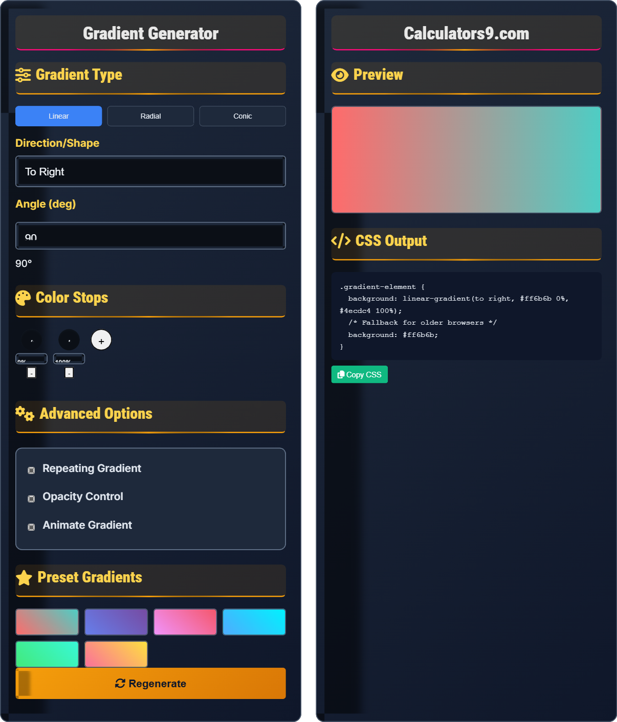
Show the generatorLinear Gradient:
- Syntax: linear-gradient(direction, color-stop1, color-stop2, ...)
- Directions: to top, to bottom, to left, to right, angle (e.g., 45deg)
- Example: linear-gradient(45deg, #ff6b6b, #4ecdc4)
Radial Gradient:
- Syntax: radial-gradient(shape size at position, color-stop1, color-stop2, ...)
- Shapes: circle, ellipse
- Example: radial-gradient(circle, #ff6b6b, #4ecdc4)
Conic Gradient:
- Syntax: conic-gradient(from angle at position, color-stop1, color-stop2, ...)
- Used for: Color wheels, pie charts, rainbow effects
- Example: conic-gradient(#ff6b6b, #4ecdc4, #45b7d1)
CSS gradients create smooth color transitions without images, reducing file size and improving performance.
Gradient Type
Direction/Shape
Angle (deg)
90°Color Stops
Advanced Options
Preset Gradients
Preview
CSS Output
Comprehensive Gradient Guide
CSS gradients allow you to display smooth transitions between two or more colors. Unlike images, gradients are vector-based and therefore scale perfectly to any resolution. They're widely used for backgrounds, buttons, and visual effects in modern web design.
There are three main types of CSS gradients:
Radial → Circular or elliptical gradients from a central point
Conic → Circular gradients rotating around a center point
Each type offers unique visual possibilities for different design needs.
Gradients offer several advantages over image-based alternatives:
- File Size: Zero bytes (generated by browser)
- Scalability: Perfect quality at any resolution
- Performance: Hardware-accelerated rendering
- Customization: Easy modification via CSS
- Accessibility: Ensure sufficient contrast for text
- Performance: Avoid overly complex gradients
- Browser Support: Provide fallbacks for older browsers
- Design Harmony: Use colors from your brand palette
Gradient Fundamentals
Specific points in a gradient where color transitions occur.
linear-gradient(direction, color1, color2, ...)
radial-gradient(shape, color1, color2, ...)
- Minimum of 2 color stops required
- Colors can be specified in any format
- Positions can be in px, %, or other units
- Transparency adds depth and dimension
Development Tips
Patterns created by repeating gradient segments.
- Stripes: repeating-linear-gradient
- Circles: repeating-radial-gradient
- Diagonal: 45deg linear gradients
- Layered: multiple gradients on same element
- Test readability of text on gradients
- Consider performance impact of complex gradients
- Provide fallbacks for older browsers
- Use sparingly for maximum impact
Gradient Learning Quiz
Which CSS gradient type is best suited for creating circular color transitions from a central point?
The answer is B) Radial Gradient. Radial gradients create circular or elliptical color transitions that emanate from a central point outward. This makes them ideal for creating effects like sunbursts, spotlight effects, or organic circular color blends.
Understanding the different gradient types is crucial for choosing the right tool for your design needs. Linear gradients flow in a straight line, radial gradients flow outward from a center point, and conic gradients rotate around a center point. Each serves different visual purposes and creates distinct aesthetic effects.
Radial Gradient: Circular gradient from center point
Central Point: Origin of gradient expansion
Elliptical: Oval-shaped gradient pattern
• Radial gradients create circular transitions
• Linear gradients create directional transitions
• Conic gradients create rotational transitions
• Use radial for organic, natural effects
• Combine with blur filters for soft transitions
• Adjust size for different focus effects
• Using linear gradients when radial is needed
• Not specifying shape and size properly
• Forgetting to consider aspect ratio
Explain the difference between linear-gradient and conic-gradient, and provide examples of when to use each.
Linear Gradient: Creates color transitions in a straight line from one point to another.
Conic Gradient: Creates color transitions that rotate around a central point like a color wheel.
Examples:
- Linear: Backgrounds, buttons, section dividers
- Conic: Color wheels, pie charts, rainbow effects, loading spinners
Linear and conic gradients serve very different visual purposes. Linear gradients are excellent for creating depth, dimension, and smooth transitions across a surface. Conic gradients excel at creating circular patterns and rotational effects that would be difficult to achieve with other gradient types.
Linear Gradient: Straight-line color transition
Conic Gradient: Rotational color transition
Color Wheel: Circular representation of colors
• Linear gradients flow in straight lines
• Conic gradients rotate around center
• Each has distinct visual applications
• Use conic for circular UI elements
• Linear gradients work best for backgrounds
• Conic can create complex patterns
• Using conic when linear would suffice
• Not understanding rotation direction
• Confusing syntax between gradient types
You need to create a vibrant background for a music streaming app that transitions smoothly from warm colors (reds/oranges) to cool colors (blues/purples). How would you implement this using CSS gradients?
For this application, a linear gradient would work well:
.music-background {
  background: linear-gradient(135deg,
    #ff6b6b,    /* Warm red */
    #ffa502,    /* Orange */
    #4ecdc4,    /* Teal */
    #45b7d1,    /* Blue */
    #96ceb4     /* Soft green-blue */
  );
}
Alternatively, for a more circular effect around a central element:
background: radial-gradient(circle,
  #ff6b6b, #ffa502, #4ecdc4, #45b7d1, #96ceb4
);
This example demonstrates how to create emotional connections through color psychology in gradients. Warm colors (reds, oranges) evoke energy and passion, while cool colors (blues, purples) convey calmness and sophistication. The diagonal direction creates visual movement that matches the dynamic nature of music.
Color Psychology: Emotional impact of colors
Warm Colors: Reds, oranges, yellows (energetic)
Cool Colors: Blues, greens, purples (calming)
• Choose colors that match brand emotion
• Consider accessibility contrast
• Test readability of text on gradients
• Use 3-5 colors for smooth transitions
• Place darker colors where text appears
• Consider using soft overlays for text
• Too many colors creating muddy appearance
• Not considering text readability
• Using harsh color transitions
A loading spinner needs to display a rotating rainbow effect using CSS. How would you implement this using gradients and animations?
Use a conic gradient with CSS animation:
.loading-spinner {
  width: 50px;
  height: 50px;
  border-radius: 50%;
  background: conic-gradient(
    red, orange, yellow, green, blue, indigo, violet, red
  );
  animation: rotate 2s linear infinite;
}

@keyframes rotate {
  from { transform: rotate(0deg); }
  to { transform: rotate(360deg); }
}
Alternatively, animate the conic gradient directly using CSS custom properties:
background: conic-gradient(
  from var(--rotation),
  red, orange, yellow, green, blue, indigo, violet
);
This demonstrates the power of combining gradients with CSS animations. Conic gradients are particularly effective for circular animations because they naturally represent color transitions around a center point. The animation rotates the entire element, creating the illusion of a spinning rainbow.
Conic Gradient: Rotational color transition
CSS Animation: Changing properties over time
Loading Spinner: Visual feedback during processing
• Conic gradients work well with rotation
• Use infinite loops for continuous animation
• Consider performance impact of animations
• Use hardware-accelerated transforms
• Consider using CSS custom properties for advanced control
• Test performance on mobile devices
• Using linear gradients for circular effects
• Not optimizing animation performance
• Creating too complex gradients that impact performance
What does the 'deg' unit represent in CSS gradient angles?
The answer is A) Degrees of rotation. In CSS gradients, the 'deg' unit represents degrees of rotation from the top (0deg). For example, 0deg points to the top, 90deg points to the right, 180deg points to the bottom, and 270deg points to the left. This allows for precise control over gradient direction.
Understanding the degree system is essential for creating gradients with specific directions. The coordinate system starts at 0 degrees pointing upward, similar to mathematical conventions. This knowledge enables designers to create gradients that align with specific visual elements or create particular visual effects.
deg Unit: Degree measurement for angles
Coordinate System: Mathematical reference frame
Gradient Direction: Path of color transition• 0deg = top direction
• 90deg = right direction
• 180deg = bottom direction
• Remember: 0deg is up, 90deg is right
• Use 45deg for diagonal effects
• Experiment with angles for creative effects
• Confusing degree directions
• Assuming 0deg is right (like compass)
• Not understanding the coordinate system
FAQ
Q: What's the difference between linear-gradient and repeating-linear-gradient?
A: linear-gradient creates a single gradient from start to finish, while repeating-linear-gradient repeats the gradient pattern infinitely.
Regular: linear-gradient(45deg, red, blue) → Single transition from red to blue
Repeating: repeating-linear-gradient(45deg, red 0%, blue 10%) → Creates diagonal stripes of red and blue repeating across the element
Repeating gradients are perfect for creating patterns like stripes, checks, or angular effects without images.
Q: How do I add opacity to gradient colors?
A: You can add opacity using several methods:
RGBA: linear-gradient(to right, rgba(255,0,0,0.5), rgba(0,0,255,0.3))
HSLA: linear-gradient(to right, hsla(0,100%,50%,0.5), hsla(240,100%,50%,0.3))
Hex with alpha: Modern browsers support #ff000080 (last 2 digits are alpha)
Opacity creates depth and layering effects in gradients, making them more visually interesting.