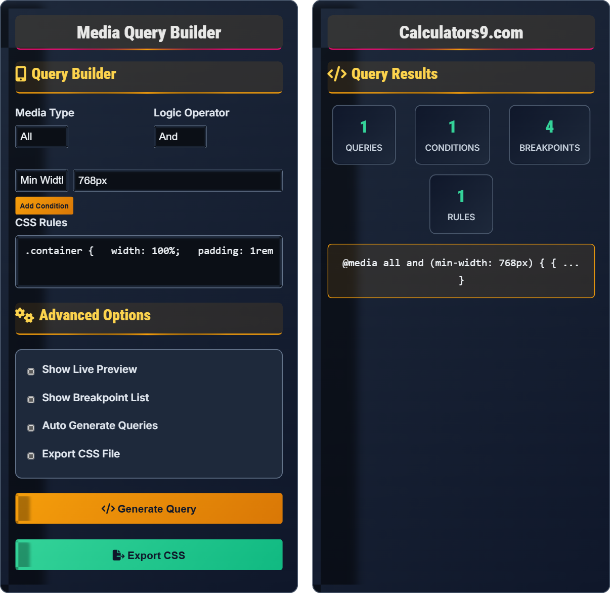
\( @media (feature: value) \{ ... \} \)
\( @media screen and (min-width: 768px) \{ ... \} \)
\( @media screen and (max-width: 767px) and (orientation: portrait) \{ ... \} \)
Where:
- \( @media \) = CSS rule for conditional styling
- \( feature \) = CSS media feature (width, height, etc.)
- \( value \) = value for the feature
- \( and \) = logical operator for multiple conditions
- \( ... \) = CSS rules applied when conditions are met
Media queries allow you to apply CSS rules based on device characteristics like screen size, orientation, or resolution.
Example: A responsive layout:
\( @media screen and (min-width: 768px) \{ \)
\( .container \{ width: 100%; \} \)
\( \} \)
This applies container styles only on screens 768px wide or larger.
Media Query Guide
What are Media Queries?
Media queries are CSS techniques that allow you to apply different styles based on the characteristics of the device being used to view the content. They are essential for creating responsive websites that adapt to different screen sizes, orientations, and capabilities.
Media Query Syntax
The fundamental syntax for media queries includes:
\( @media media-type and (media-feature: value) \{ ... \} \)
Where:
- \( @media \) = CSS rule for conditional styling
- \( media-type \) = device type (screen, print, etc.)
- \( media-feature \) = characteristic to query (width, height, etc.)
- \( value \) = value for the feature
Common Media Features
1
Width: min-width, max-width - most commonly used for responsive layouts.
2
Height: min-height, max-height - useful for tall screens or mobile devices.
3
Orientation: portrait, landscape - based on device orientation.
4
Resolution: device pixel density for high-resolution displays.
When to Use Media Queries
Media queries are most effective in these scenarios:
- Responsive Layouts: Adapting grid systems and component arrangements
- Typography: Adjusting font sizes for different screen sizes
- Images: Serving appropriate image sizes and resolutions
- Navigation: Converting between desktop and mobile navigation patterns
Best Practices
- Mobile First: Start with mobile styles and add enhancements for larger screens
- Logical Breakpoints: Choose breakpoints based on content rather than devices
- Test Thoroughly: Verify designs across different devices and screen sizes
- Performance: Minimize the number of media queries for efficiency
Query Fundamentals
Media Type vs Feature
Media type specifies the device category, features query specific characteristics.
Query Syntax
\( @media type and (feature: value) \{ ... \} \)
Where type=device category, feature=characteristic, value=threshold.
Key Rules:
- Use and for multiple conditions
- Choose appropriate breakpoints
- Test across devices
Responsive Design
Breakpoint Strategy
Choose breakpoints based on content needs, not device specifications.
Implementation
- Start with mobile-first approach
- Identify content breakpoints
- Implement responsive patterns
- Test on real devices
Considerations:
- Performance impact
- Browser compatibility
- Accessibility requirements
- Future device support
Media Query Examples
Basic Media Query Implementation
.container
{
width
:
100%;
padding
:
1rem;
}
@media screen and (min-width: 768px)
{
.container
{
max-width
:
750px;
padding
:
2rem;
}
}
Advanced Multi-Feature Query
@media screen and (max-width: 767px) and (orientation: portrait) and (-webkit-min-device-pixel-ratio: 2)
{
.hero-image
{
background-image
:
url('hero-2x.jpg');
}
}
Media Query Learning Quiz
Question 1: Multiple Choice - Query Syntax
Which of the following is the correct syntax for a media query targeting screens wider than 768px?
Solution:
The answer is B) @media screen and (min-width: 768px) { ... }. The correct syntax requires the 'and' keyword between the media type and the media feature. This targets screens that are at least 768px wide.
Pedagogical Explanation:
Understanding media query syntax is fundamental to responsive design. The 'and' operator is crucial when combining a media type with a media feature. Without it, the query won't work correctly. The syntax follows the pattern: @media media-type and (feature: value) { styles }.
Key Definitions:
Media Query: CSS rule for conditional styling
Media Type: Device category (screen, print, etc.)
Media Feature: Device characteristic (width, height, etc.)
Important Rules:
• Use 'and' to combine type and feature
• Parentheses around feature expressions
• Proper syntax is critical for functionality
Tips & Tricks:
• Remember: @media type and (feature: value)
• Use min-width for mobile-first approach
• Test queries in browser dev tools
Common Mistakes:
• Forgetting the 'and' keyword
• Missing parentheses around features
• Incorrect operator usage
Question 2: Media Query Logic Understanding
What does this media query target: @media screen and (min-width: 768px) and (max-width: 1023px)?
Solution:
This media query targets screens that are at least 768px wide but no more than 1023px wide. This is commonly used for tablets in landscape mode or small laptops. The 'and' operator means both conditions must be true simultaneously.
Range: 768px ≤ screen width ≤ 1023px
Devices: Primarily tablets in landscape orientation or small laptops.
Pedagogical Explanation:
Multiple conditions in a media query are joined with 'and', meaning all conditions must be satisfied. This creates a range between two values. The min-width ensures the screen is at least 768px, while max-width ensures it's no more than 1023px, creating a specific window for intermediate-sized devices.
Key Definitions:
Range Query: Targets specific range of values
Logical AND: All conditions must be true
Breakpoint Range: Specific device category
Important Rules:
• 'and' means all conditions must be true
• Range queries define specific device categories
• Order of conditions doesn't matter
Tips & Tricks:
• Combine min and max for ranges
• Use for intermediate device sizes
• Test actual device widths
Common Mistakes:
• Confusing 'and' with 'or' logic
• Overlapping breakpoint ranges
• Not considering device orientation
Question 3: Word Problem - Responsive Design
A web developer wants to create a responsive layout where a sidebar is visible on desktop (≥1024px) but hidden on mobile (≤767px). They want the main content to take full width on mobile but 70% width on desktop. Write the appropriate media queries for this layout.
Solution:
Mobile-first approach:
.sidebar
{
display
:
none;
}
.main-content
{
width
:
100%;
}
@media screen and (min-width: 1024px)
{
.sidebar
{
display
:
block;
}
.main-content
{
width
:
70%;
}
}
This approach starts with mobile styles as defaults and adds desktop enhancements.
Key Definitions:
Mobile First: Start with mobile styles
Progressive Enhancement: Add features for capable devices
Default Styles: Base styles for smallest screens
Important Rules:
• Mobile styles are defaults
• Desktop queries add enhancements
• Use min-width for mobile-first
Tips & Tricks:
• Use min-width for upward breakpoints
• Test with browser dev tools
• Consider content-based breakpoints
Common Mistakes:
• Desktop-first approach causing bloat
• Not testing mobile performance
• Device-specific rather than content-based
Question 4: Application-Based Problem - Orientation Detection
A designer wants to adjust a mobile app interface based on device orientation. When in portrait mode, the navigation should be at the bottom. When in landscape mode, it should move to the side. Write media queries to handle this, assuming the navigation has class 'nav'.
Solution:
.nav
{
position
:
fixed;
bottom
:
0;
left
:
0;
right
:
0;
height
:
60px;
}
@media screen and (orientation: landscape) and (max-height: 500px)
{
.nav
{
position
:
fixed;
top
:
0;
right
:
0;
bottom
:
0;
width
:
80px;
}
}
This targets orientation while considering screen height to avoid affecting desktop.
Key Definitions:
Orientation: Device rotation (portrait/landscape)
Multi-Feature Query: Uses multiple conditions
Constraint Logic: Additional conditions for precision
Important Rules:
• Orientation affects mobile primarily
• Add constraints to avoid desktop conflicts
• Test on actual mobile devices
Tips & Tricks:
• Combine orientation with size constraints
• Consider touch vs mouse interactions
• Test both orientations thoroughly
Common Mistakes:
• Not constraining orientation queries
• Assuming all mobile devices are the same
• Ignoring touch interface differences
Question 5: Multiple Choice - Best Practices
Which of the following represents the best practice for creating responsive breakpoints?
Solution:
The answer is B) Use content-based breakpoints. Content-based breakpoints focus on when the layout breaks rather than specific device sizes. This approach is more future-proof and adaptable to new devices. Instead of targeting specific devices, you adjust the layout when content no longer fits well at a particular size.
Pedagogical Explanation:
Content-based breakpoints are superior to device-specific ones because there are countless device sizes in the market. By focusing on when the content layout becomes problematic, you create a more robust responsive system. This approach ensures your design works on current and future devices without requiring constant updates.
Key Definitions:
Content-Based: Breakpoints determined by content needs
Device-Specific: Breakpoints for particular devices
Future-Proof: Works with new devices
Important Rules:
• Break when content no longer fits well
• Focus on user experience over device specs
• Test with real content
Tips & Tricks:
• Resize browser to find natural breaks
• Use real content for testing
• Consider typography and spacing
Common Mistakes:
• Targeting specific devices instead of content
• Using too many breakpoints
• Not testing with real content