Responsive Breakpoint Calculator
CSS media query generator • Live preview
Responsive Breakpoints:
Show the calculatorCommon Breakpoints:
- Mobile: 320px - 480px
- Mobile Landscape: 481px - 768px
- Tablet Portrait: 768px - 1024px
- Tablet Landscape: 1024px - 1200px
- Desktop: 1200px+
Media Query Syntax:
@media (min-width: 768px) { /* Tablet and larger */ }
@media (max-width: 767px) { /* Mobile and smaller */ }
@media (min-width: 768px) and (max-width: 1023px) { /* Tablet only */ }
Responsive breakpoints ensure optimal user experience across all devices.
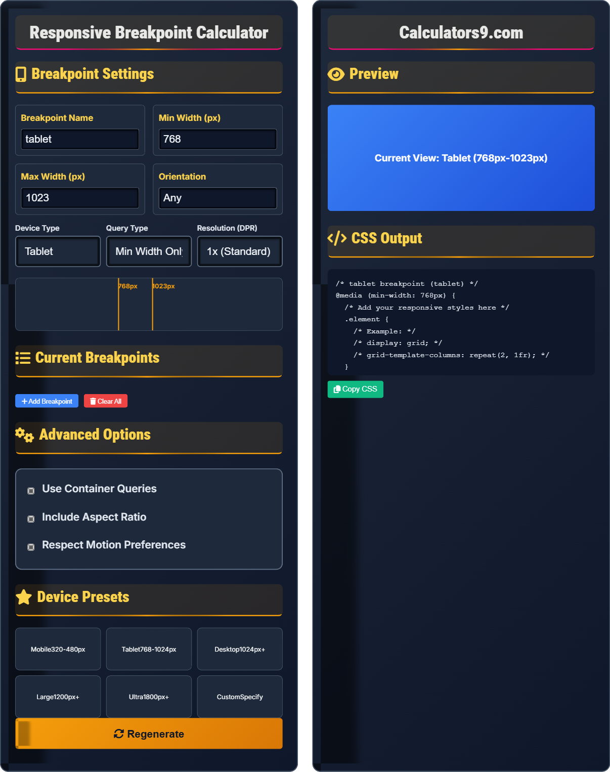
Breakpoint Settings
Breakpoint Name
Min Width (px)
Max Width (px)
Orientation
Current Breakpoints
Advanced Options
Device Presets
Preview
CSS Output
Comprehensive Responsive Design Guide
Responsive breakpoints are specific viewport widths where a website's layout changes to provide an optimal viewing experience across different devices. They are implemented using CSS media queries to apply different styles based on screen size.
Common responsive categories:
Tablet → 768px - 1023px
Desktop → 1024px - 1199px
Large Desktop → 1200px+
These ranges help ensure optimal user experience across devices.
Responsive breakpoints offer several advantages:
- Accessibility: Works across all devices
- SEO: Google favors responsive sites
- Efficiency: Single codebase
- Usability: Optimized for each device
- Content-Driven: Design around content, not devices
- Progressive Enhancement: Start mobile-first
- Testing: Test on actual devices
- Performance: Optimize for each breakpoint
Breakpoint Fundamentals
Define responsive conditions with CSS.
@media (min-width: 768px) {
  .element {
    display: grid;
  }
}
Example: @media (min-width: 768px) and (max-width: 1023px) { ... }
- Use min-width for progressive enhancement
- Combine conditions with and/or
- Consider device aspect ratios
- Test across all targeted devices
Development Tips
Start with smallest screens and build up.
- Mobile: Single column
- Tablet: Two column
- Desktop: Three+ column
- Large: Grid with sidebar
- Consider actual device usage patterns
- Test with real content
- Optimize images for each breakpoint
- Ensure touch targets are accessible
Responsive Design Learning Quiz
What is the recommended approach for implementing responsive breakpoints?
The answer is B) Mobile-first approach. The mobile-first approach starts with the smallest screen size and progressively enhances the design for larger screens using min-width media queries. This ensures that mobile users get an optimized experience and that enhancements are added for larger screens.
The mobile-first approach is recommended because it prioritizes the most constrained environment first. By starting with mobile, you ensure that the core functionality and content are accessible on all devices. Additional features and layout enhancements are then added for larger screens, creating a progressive enhancement strategy.
Mobile-First: Start with smallest screen and build up
Progressive Enhancement: Add features for larger screens
Graceful Degradation: Remove features for smaller screens
• Start with mobile base styles
• Use min-width for breakpoints
• Enhance for larger screens
• Design core content first
• Add layout enhancements progressively
• Test mobile experience thoroughly
• Starting with desktop design
• Not considering mobile constraints
• Adding too many features for mobile
What is the correct CSS media query syntax to target tablets in portrait orientation (768px to 1023px)?
@media (min-width: 768px) and (max-width: 1023px) and (orientation: portrait) {
  /* Tablet portrait styles */
}
This query targets devices with a viewport width between 768px and 1023px and in portrait orientation. The min-width ensures it only applies to tablets and larger, while max-width excludes desktop devices, and orientation: portrait restricts it to portrait mode.
This example demonstrates how to combine multiple conditions in a media query. The 'and' operator connects multiple conditions that must all be true. The min-width and max-width create a range, while orientation further refines the target. This precise targeting allows for optimal experiences on specific device configurations.
Media Query: CSS condition for device characteristics
Logical Operators: and, or, not keywordsFeature Queries: Conditions like width, height, orientation
• Use 'and' to combine conditions
• Min-width for progressive enhancement
• Max-width for exclusion
• Use ranges for specific device targeting
• Combine orientation for precision
• Test with actual devices
• Confusing min-width with max-width
• Not testing combined conditions
• Using only width for targeting
You're designing a responsive navigation menu that should be a hamburger menu on mobile, expand to a horizontal menu on tablets, and include a search bar on desktop. How would you implement this using CSS media queries?
/* Mobile: Hamburger menu */
.nav-menu {
  display: none;
  position: absolute;
  top: 100%;
  left: 0;
  width: 100%;
}

.hamburger {
  display: block;
}

/* Tablet: Horizontal menu */
@media (min-width: 768px) {
  .nav-menu {
    display: flex;
    position: static;
    width: auto;
  }
  .hamburger {
    display: none;
  }
}

/* Desktop: With search bar */
@media (min-width: 1024px) {
  .nav-menu {
    justify-content: space-between;
  }
  .search-bar {
    display: block;
  }
}
This creates a progressive enhancement approach that starts with a mobile-friendly hamburger menu and adds features as screen size increases.
This example demonstrates the mobile-first approach with progressive enhancement. Starting with the mobile layout ensures that the core navigation functionality is available on all devices. As screen space increases, the layout is enhanced with additional features like horizontal layout and search functionality.
Progressive Enhancement: Adding features for larger screens
Mobile-First: Starting with smallest screen styles
Hamburger Menu: Collapsible mobile navigation
• Start with mobile base styles
• Use min-width for progressive enhancement
• Add features as screen size increases
• Hide elements with display: none
• Use flexbox for responsive layouts
• Consider touch target sizes
• Starting with desktop layout
• Not considering mobile constraints
• Adding too many features for mobile
A responsive website is experiencing performance issues on mobile devices. How would you optimize the CSS to ensure better performance while maintaining responsive design?
Optimize responsive CSS performance:
/* Use efficient selectors */
@media (min-width: 768px) {
  .component { /* Avoid descendant selectors */ }
}

/* Minimize repaints/reflows */
@media (min-width: 768px) {
  .element {
    transform: translateX(100px); /* Use transform instead of left */
  }
}

/* Optimize for mobile first */
.component { /* Base mobile styles */ }
@media (min-width: 768px) { /* Tablet enhancements */ }
@media (min-width: 1024px) { /* Desktop enhancements */ }

/* Use contain property */
@media (min-width: 768px) {
  .container {
    contain: layout style paint;
  }
}
Additional optimizations include: minimizing CSS file size, using efficient property animations, and testing on actual devices.
Performance optimization for responsive design involves understanding which CSS properties trigger expensive layout, paint, and composite operations. Using transform and opacity for animations, efficient selectors, and containment properties can significantly improve performance while maintaining responsive functionality.
Repaint: Browser redrawing elements
Reflow: Browser recalculating layout
Containment: Limiting browser calculations
• Use transform for animations
• Efficient selectors for performance
• Test on target devices
• Use contain property for isolation
• Minimize complex selectors
• Test with browser dev tools
• Using layout-triggering properties for animations
• Not testing performance on mobile
• Overusing complex selectors
What is the main difference between CSS media queries and container queries?
The answer is C) Container queries depend on container size, not viewport. While media queries depend on viewport dimensions (screen size), container queries depend on the size of a specific container element. This allows components to adapt based on their available space rather than the entire viewport size.
Container queries represent a newer approach to responsive design that allows components to be self-contained and responsive based on their immediate context. Unlike media queries which affect the entire document, container queries only affect the component within the queried container, making components more modular and reusable.
Media Queries: Based on viewport dimensions
Container Queries: Based on container dimensions
Viewport: Entire browser window size
• Media queries: viewport-based
• Container queries: element-based
• Container queries enable modular components
• Use container queries for reusable components
• Media queries for global layout
• Consider browser support
• Confusing container with media queries
• Not understanding context differences
• Using wrong approach for component design
FAQ
Q: What's the difference between min-width and max-width in media queries?
A: min-width applies styles when the viewport is AT LEAST that wide, while max-width applies styles when the viewport is NO MORE than that wide.
Min-width: @media (min-width: 768px) → Applies to 768px and larger
Max-width: @media (max-width: 767px) → Applies to 767px and smaller
Use min-width for progressive enhancement (mobile-first) and max-width for desktop-first approaches.
Q: How do I test my responsive breakpoints effectively?
A: Test responsive breakpoints using multiple methods:
Browser DevTools → Responsive Design Mode
Physical devices → Real user experience
BrowserStack/other tools → Multiple device testing
Also test with real content, not just placeholders, and consider network conditions and performance on each device type.