Text Shadow Creator
CSS text shadow generator • Live preview
Text Shadow Syntax:
Show the generatorBasic Syntax:
- text-shadow: h-offset v-offset blur-radius color;
- h-offset: Horizontal offset (positive = right, negative = left)
- v-offset: Vertical offset (positive = down, negative = up)
- blur-radius: Blur amount (0 = sharp, higher = more blurred)
- color: Shadow color
Multiple Shadows:
- Syntax: text-shadow: shadow1, shadow2, shadow3;
- Example: text-shadow: 2px 2px 4px rgba(0,0,0,0.5), 4px 4px 8px rgba(0,0,0,0.3);
Text shadows enhance typography and add depth to text elements, creating visual interest and improved readability.
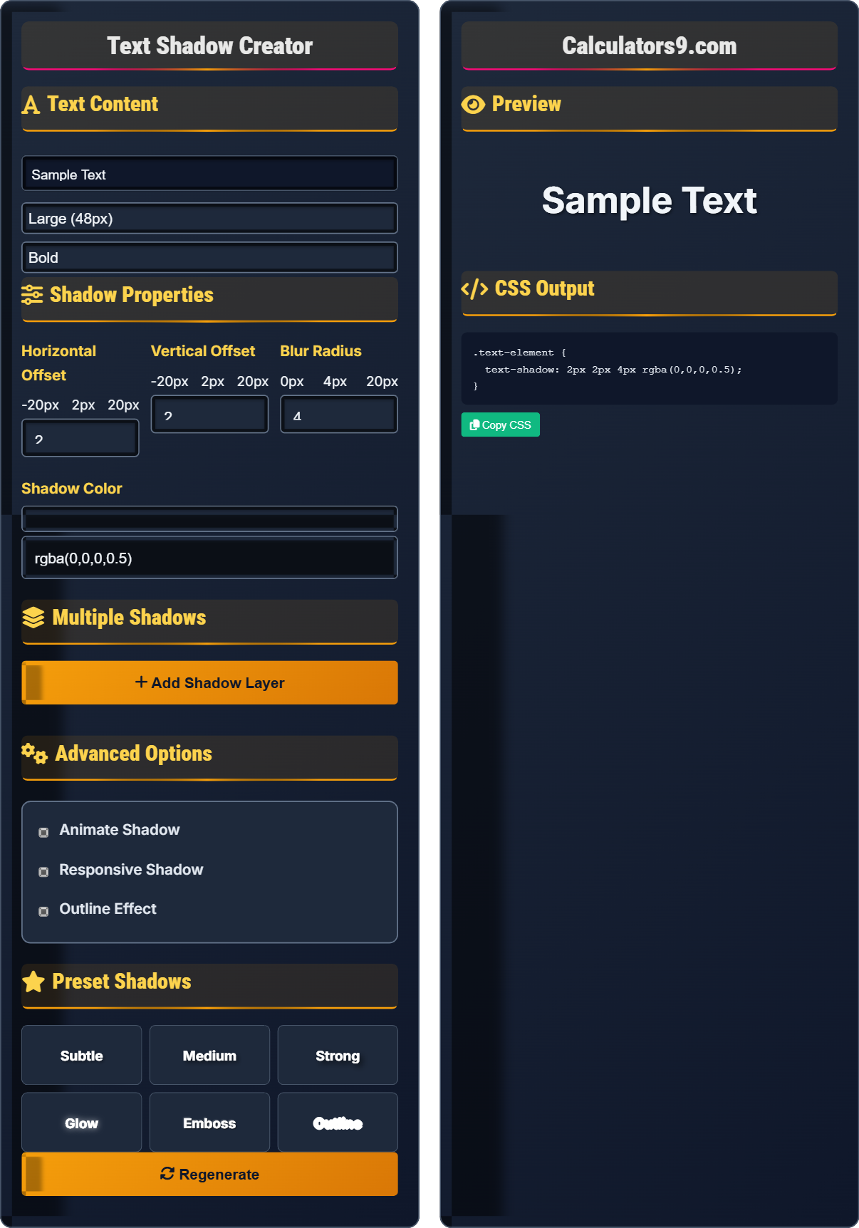
Text Content
Shadow Properties
Horizontal Offset
Vertical Offset
Blur Radius
Shadow Color
Multiple Shadows
Advanced Options
Preset Shadows
Preview
CSS Output
Comprehensive Text Shadow Guide
CSS text-shadow is a property that allows you to add shadow effects to text elements. Unlike images, text shadows are vector-based and scale perfectly to any resolution. They're widely used for enhancing typography and creating visual effects in modern web design.
Text shadows consist of four main components:
Vertical Offset → Distance up/down from text
Blur Radius → Softness of shadow edges
Color → Appearance of shadow
These components work together to create various text effects.
Text shadows offer several advantages:
- File Size: Zero bytes (generated by browser)
- Scalability: Perfect quality at any resolution
- Performance: Hardware-accelerated rendering
- Customization: Easy modification via CSS
- Readability: Ensure sufficient contrast
- Performance: Avoid excessive blur values
- Accessibility: Don't rely solely on shadows
- Consistency: Maintain uniform shadow styles
Shadow Fundamentals
Four properties define text shadow appearance.
text-shadow: h-offset v-offset blur-radius color;
Example: text-shadow: 2px 2px 4px rgba(0,0,0,0.5);
- First two values (offsets) are required
- Color defaults to current color if omitted
- Multiple shadows separated by commas
- Can be animated with transitions
Development Tips
Colors with alpha transparency for subtle effects.
- Subtle shadows: 1px 1px 2px rgba(0,0,0,0.3)
- Glow effects: 0 0 10px rgba(255,255,255,0.8)
- Outline: Multiple shadows in all directions
- Emboss: Positive and negative offsets
- Test readability with different backgrounds
- Consider accessibility contrast
- Use consistently throughout design system
- Match shadows to lighting concept
Text Shadow Learning Quiz
What does the 'blur-radius' value in text-shadow control?
The answer is B) Softness of shadow edges. The blur-radius value in text-shadow controls how soft or hard the edges of the shadow appear. A value of 0 creates a sharp shadow with no blur, while higher values create increasingly softer, more diffused shadows.
Understanding each component of the text-shadow property is essential for creating effective text effects. The blur-radius specifically affects the transition between the shadow and the background, simulating the natural diffusion of light and shadow in the physical world. This is particularly important for creating realistic depth effects.
Blur Radius: Amount of softness in shadow edges
Sharp Shadow: 0 blur value, hard edges
Soft Shadow: Higher blur value, diffused edges
• Higher blur values create softer shadows
• 0 blur creates sharp shadow edges
• Blur cannot be negative
• Use low blur (1-2px) for subtle effects
• Higher blur (8px+) for glow effects
• Combine with offset for depth perception
• Confusing blur-radius with offset values
• Using excessive blur values affecting readability
• Not understanding the relationship with offset
Explain how to create an embossed text effect using text-shadow, and provide an example.
An embossed effect is created by using both positive and negative offset values to simulate raised text. This creates shadows on one side and highlights on the opposite side.
Example:
text-shadow: 1px 1px 2px rgba(0,0,0,0.8),
              -1px -1px 2px rgba(255,255,255,0.5);
The first shadow creates a dark shadow in the lower-right direction, while the second creates a lighter highlight in the upper-left direction, giving the appearance of raised text.
The emboss effect works by simulating a light source hitting the text from a particular direction. The dark shadow appears on the opposite side of the light source, while the highlight appears on the same side as the light source. This creates the illusion of depth and texture on flat text.
Embossed Effect: Raised text appearance
Highlight: Light-colored shadow for raised effect
Shadow: Dark-colored shadow for depth
• Use opposing offset directions
• Combine dark and light colors
• Keep blur values low for crisp effect
• Use subtle colors for realistic effect
• Adjust offset direction for different lighting
• Combine with background color for best results
• Using same offset directions for both shadows
• Excessive blur making effect unclear
• Colors too contrasting destroying effect
You need to create a heading that appears to glow softly against a dark background. The glow should be subtle and inviting rather than harsh. How would you implement this using CSS text-shadow?
Create a soft glow using a large blur radius with a light color:
.heading {
  color: #ffffff;
  text-shadow: 0 0 10px rgba(255,255,255,0.3),
               0 0 20px rgba(255,255,255,0.2),
               0 0 30px rgba(255,255,255,0.1);
}
This creates multiple layers of glow with decreasing opacity, creating a soft, ethereal effect.
This example demonstrates how multiple shadows with varying blur radii and opacities can create complex effects. The layered approach with decreasing opacity creates a more natural glow than a single shadow. The zero offset ensures the glow appears evenly around the text.
Glow Effect: Luminous appearance around text
Layered Shadows: Multiple shadows for complex effects
Zero Offset: No displacement from original text
• Use multiple shadows for soft glow
• Decreasing opacity creates natural effect
• Zero offset for even glow distribution
• Start with low opacity (0.1-0.3)
• Use multiple layers for smoother glow
• Adjust color to match design theme
• Using single shadow for glow effect
• Opacity too high creating harsh look
• Not considering background color contrast
A text shadow that looks perfect on desktop appears too subtle on mobile devices. How would you adjust the shadow to maintain visibility across different screen sizes?
Use media queries to adjust shadow properties based on screen size:
.text-element {
  text-shadow: 2px 2px 4px rgba(0,0,0,0.5);
}

@media (max-width: 768px) {
  .text-element {
    text-shadow: 3px 3px 6px rgba(0,0,0,0.6);
  }
}

@media (max-width: 480px) {
  .text-element {
    text-shadow: 4px 4px 8px rgba(0,0,0,0.7);
  }
}
This progressively increases shadow intensity on smaller screens.
This demonstrates the importance of responsive design for text effects. Text shadows that look appropriate on large screens with high resolution can appear too subtle on smaller mobile screens. Adjusting shadow properties based on screen size ensures consistent visual experience across all devices.
Responsive Design: Adapting layout to different screens
Media Queries: CSS rules for different conditions
Visual Hierarchy: Relative importance of elements
• Increase shadow intensity on smaller screens
• Use relative units when possible
• Test shadows on actual devices
• Consider accessibility implications
• Not considering mobile viewing distances
• Using same shadows across all screen sizes
• Ignoring performance on mobile devices
What is the correct order of values in the text-shadow property?
The answer is B) h-offset, v-offset, blur-radius, color. The correct syntax for text-shadow is: text-shadow: h-offset v-offset blur-radius color;. The horizontal and vertical offsets are required, while blur-radius and color are optional (with defaults).
Memorizing the correct order is important for writing valid CSS. The horizontal offset and vertical offset must come first as they are required values. Understanding this sequence helps prevent syntax errors and makes CSS more readable and maintainable.
h-offset: Horizontal distance of shadow
v-offset: Vertical distance of shadow
Required Values: Must be specified in CSS
• First two values (offsets) are required
• Order: h-offset, v-offset, blur-radius, color
• Negative values allowed for offsets
• Remember: "Have Very Big Cats?" (H-V-B-C)
• Practice with common combinations
• Use CSS validators to catch syntax errors
• Mixing up the order of values
• Forgetting that offsets are required
• Placing color before blur-radius
FAQ
Q: What's the difference between text-shadow and box-shadow?
A: text-shadow applies shadows to text content only, while box-shadow applies shadows to the entire element's box (including padding, border, and content).
Text-shadow: text-shadow: 2px 2px 4px rgba(0,0,0,0.5); → Only affects the text characters
Box-shadow: box-shadow: 2px 2px 4px rgba(0,0,0,0.5); → Affects the entire element box
Use text-shadow for typographic effects and box-shadow for element depth and layering.
Q: How do I create a text outline effect with text-shadow?
A: Create an outline by using multiple shadows in different directions:
text-shadow: 1px 0 0 #000, -1px 0 0 #000, 0 1px 0 #000, 0 -1px 0 #000; → Simple outline
text-shadow: 1px 1px 0 #000, -1px -1px 0 #000, 1px -1px 0 #000, -1px 1px 0 #000; → Diagonal outline
For thicker outlines, add more shadows in intermediate directions.