Transition Timer
CSS transition generator • Live preview
CSS Transition Properties:
Show the generatorBasic Properties:
- transition-property: Which properties to animate
- transition-duration: How long the transition takes
- transition-timing-function: Speed curve of transition
- transition-delay: Delay before transition starts
Shorthand:
transition: property duration timing-function delay;
Example: transition: all 0.3s ease-in-out 0s;
CSS transitions provide smooth animations between CSS property changes without JavaScript.
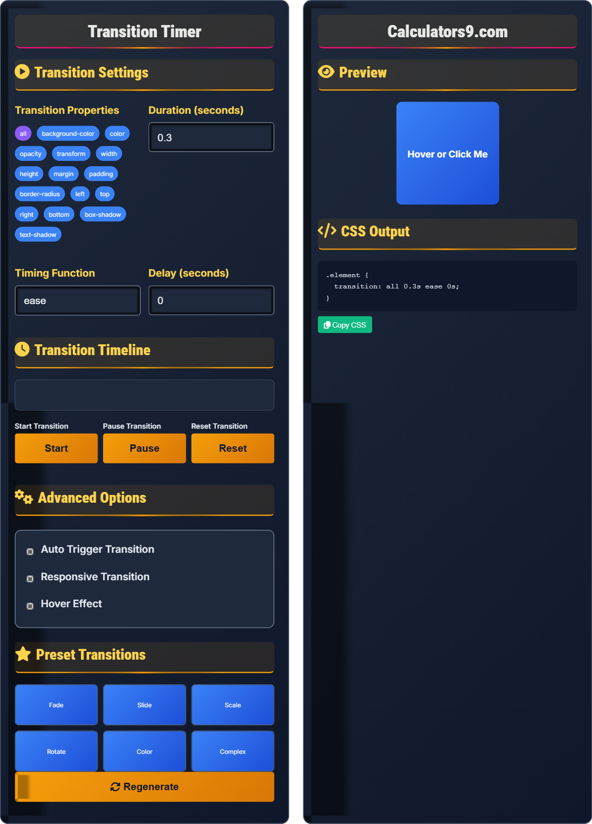
Transition Settings
Transition Properties
Duration (seconds)
Timing Function
Delay (seconds)
Transition Timeline
Advanced Options
Preset Transitions
Preview
CSS Output
Comprehensive Transition Guide
CSS transitions allow you to change property values smoothly over a specified duration. They provide a way to control animation speed for changing CSS properties, creating smooth and engaging user experiences without JavaScript.
CSS transitions consist of several components:
Duration → How long the transition takes
Timing Function → Speed curve of transition
Delay → Wait time before starting
These components work together to create smooth animations.
CSS transitions offer several advantages:
- Performance: Hardware-accelerated rendering
- Efficiency: No JavaScript required
- Scalability: Work across devices
- Customization: Full control over timing
- Performance: Animate transform and opacity
- Accessibility: Respect prefers-reduced-motion
- Duration: Keep transitions under 1 second
- Purpose: Serve functional purposes
Transition Fundamentals
Define smooth property changes over time.
transition: property duration timing-function delay;
Example: transition: background-color 0.3s ease-in-out;
- Transitions work on property changes
- Duration is required
- Can specify multiple properties
- Timing functions control speed curve
Development Tips
Optimize transitions for smooth performance.
- Transform: translate, rotate, scale
- Opacity: 0 to 1 changes
- Will-change: hint for browser
- Hardware acceleration: 3D transforms
- Test performance on mobile devices
- Consider accessibility preferences
- Keep transitions purposeful
- Provide controls when appropriate
Transition Learning Quiz
What is the correct syntax for a CSS transition that affects all properties with a duration of 0.5 seconds and ease-in-out timing?
The answer is A) transition: all 0.5s ease-in-out;. The correct order for the transition shorthand is: property, duration, timing-function, delay. When using the shorthand, the duration is required and must come after the property.
Understanding the correct order of transition properties is crucial for proper implementation. The standard order is: transition-property, transition-duration, transition-timing-function, and transition-delay. This order ensures the browser correctly interprets each component of the transition.
Shorthand: Combines multiple properties
Duration: Time for transition completion
Timing Function: Speed curve of transition
• Duration is always required
• Property comes first
• Order matters in shorthand
• Use 'all' for all properties
• Duration must come after property
• Delay is optional and last
• Wrong order of properties
• Forgetting required duration
• Misunderstanding shorthand syntax
How would you create a button that smoothly changes background color when hovered? Provide the complete CSS code and explain each part.
.button {
  background-color: #3b82f6;
  transition: background-color 0.3s ease-in-out;
}

.button:hover {
  background-color: #2563eb;
}
Explanation:
- background-color: #3b82f6; Sets initial color
- transition: background-color 0.3s ease-in-out; Defines transition
- .button:hover: Target for hover state
- background-color: #2563eb; Final color on hover
This example demonstrates the relationship between transition definition and state change. The transition is defined in the normal state, and when the hover state changes the property, the transition creates a smooth animation between the two values.
Initial State: Normal CSS values
Target State: Changed values on event
Smooth Animation: Gradual property change
• Define transition in initial state
• Change property in target state
• Property must be animatable
• Define transitions on initial state
• Use meaningful hover states
• Test different timing functions
• Defining transition on hover state
• Using non-animatable properties
• Forgetting to change the property value
You need to create a card that smoothly expands to show more details when clicked. The card should grow in height and fade in additional content. How would you implement this using CSS transitions?
.card {
  height: 100px;
  overflow: hidden;
  transition: height 0.3s ease-in-out;
}

.card-details {
  opacity: 0;
  transition: opacity 0.3s ease-in-out 0.1s; /* Delay for smoother effect */
}

.card.expanded {
  height: 200px;
}

.card.expanded .card-details {
  opacity: 1;
}
This creates a smooth expansion effect by animating height and opacity with a slight delay for the content.
This example demonstrates how multiple transitions can work together to create complex effects. The height transition expands the container, while the opacity transition reveals the content. The delay on the content transition creates a staggered effect that feels more natural.
Height Transition: Changes element size
Opacity Transition: Changes visibility
Staggered Effect: Sequential animations
• Use overflow: hidden for height changes
• Combine multiple transitions
• Use delays for coordinated effects
• Use max-height instead of height for auto
• Combine with transform for better performance
• Test timing with different delays
• Animating height directly (performance)
• Forgetting overflow: hidden
• Not coordinating multiple transitions
A transition is causing jankiness on older devices. How would you optimize the transition to maintain smooth performance while keeping the visual effect?
.optimized-element {
  /* Use transform instead of left/right/top/bottom */
  transition: transform 0.3s ease-in-out, opacity 0.3s ease-in-out;
  /* Enable hardware acceleration */
  will-change: transform, opacity;
  /* Or force hardware acceleration */
  transform: translateZ(0);
}

.optimized-element.moved {
  transform: translateX(100px);
  opacity: 1;
}
Additional optimizations:
- Only animate transform and opacity properties
- Use will-change for browser hints
- Consider using translateZ(0) for hardware acceleration
- Reduce transition complexity when possible
Performance optimization for transitions involves understanding which CSS properties trigger expensive layout and paint operations. Properties like transform and opacity can be handled by the GPU without affecting layout, making them ideal for smooth animations.
GPU Acceleration: Hardware processing
Paint Operations: Rendering process
Layout Triggers: Expensive calculations
• Animate only transform and opacity
• Use hardware acceleration
• Test on target devices
• Use translate instead of left/right
• Use scale instead of width/height
• Test with browser dev tools
• Animating layout-triggering properties
• Not testing on mobile devices
• Using complex transitions unnecessarily
Which timing function creates an animation that starts slowly, speeds up in the middle, and then slows down at the end?
The answer is B) ease. The 'ease' timing function is the default and creates an animation that starts slowly, accelerates in the middle, and then decelerates at the end. This creates a natural, smooth motion that feels organic to users.
Understanding timing functions is crucial for creating natural-looking animations. The 'ease' function mimics real-world physics where objects accelerate and decelerate. Other functions like 'linear' move at constant speed, while 'ease-in' and 'ease-out' have different acceleration patterns.
Timing Function: Speed curve of animation
Acceleration: Increasing speed
Deceleration: Decreasing speed
• ease = slow-fast-slow
• linear = constant speed
• ease-in = slow-fast
• Use ease for natural motion
• Use linear for mechanical feel
• Test different functions for feel
• Using linear for organic motions
• Not understanding function differences
• Not testing with actual transitions
FAQ
Q: What's the difference between CSS transitions and CSS animations?
A: CSS transitions animate between two states (like hover), while CSS animations run automatically with full control over each step.
Transitions: transition: property duration; → Requires state change
Animations: animation: name duration; → Runs automatically with @keyframes
Use transitions for simple state changes and animations for complex, multi-step sequences.
Q: How do I transition multiple properties with different durations?
A: List each property separately with its own duration:
transition: background-color 0.3s ease, transform 0.5s ease, opacity 0.2s ease;
This creates different timing for each property while maintaining the transition effect.
You can also use comma-separated values for each transition component: transition: property1 duration1, property2 duration2;