Typography Scale Calculator
CSS typography scale generator • Live preview
Typography Scale Principles:
Show the generatorCommon Ratios:
- Minor Second: 1.067 (15:16)
- Major Second: 1.125 (8:9)
- Minor Third: 1.2 (5:6)
- Major Third: 1.25 (4:5)
- Perfect Fourth: 1.333 (3:4)
- Augmented Fourth: 1.414 (√2)
- Perfect Fifth: 1.5 (2:3)
Formula:
Scale[n] = Base_Size × (Ratio ^ n)
Typography scales create consistent, harmonious font sizes throughout a design system.
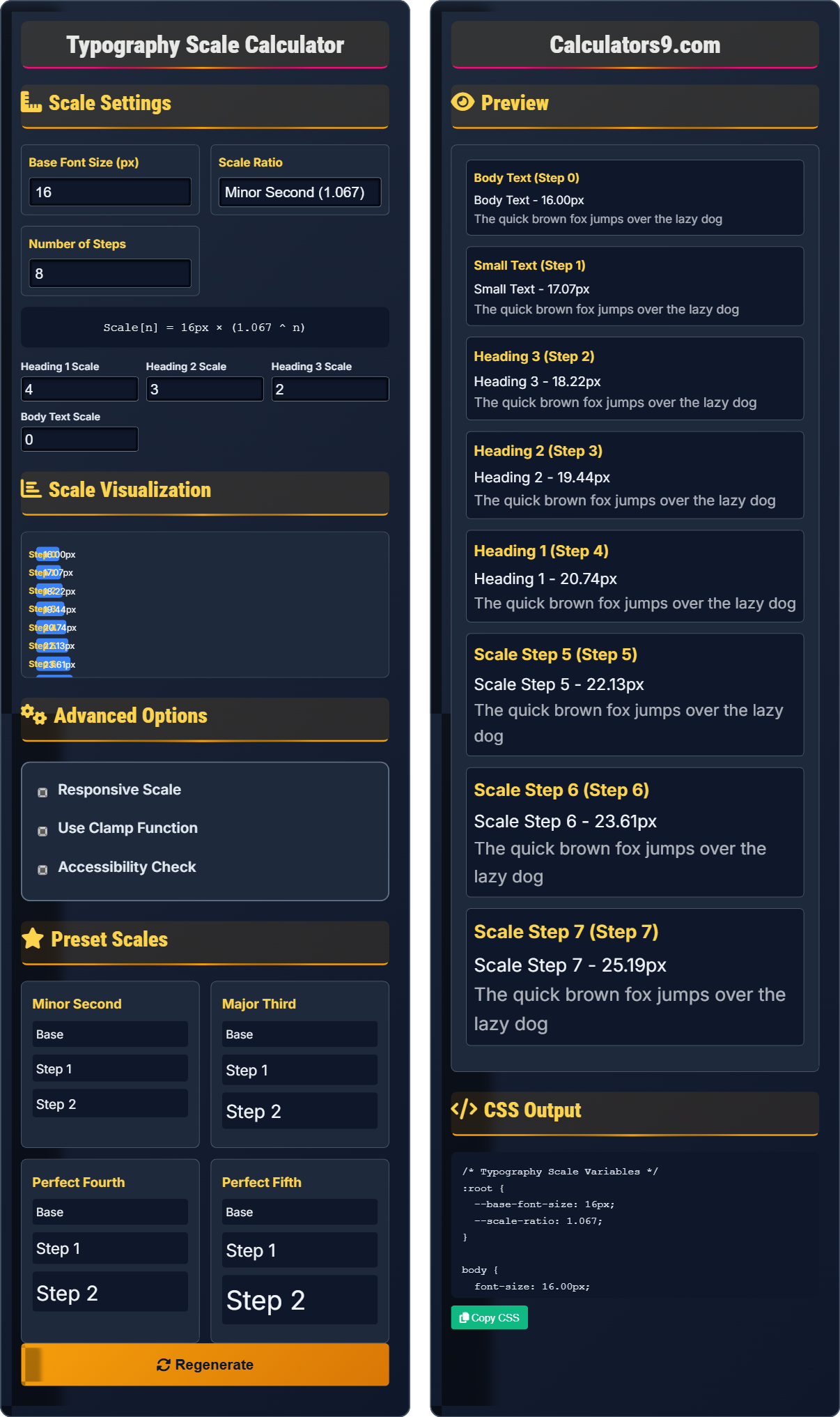
Scale Settings
Base Font Size (px)
Scale Ratio
Number of Steps
Scale Visualization
Advanced Options
Preset Scales
Preview
CSS Output
Comprehensive Typography Scale Guide
A typography scale is a system of font sizes that work harmoniously together based on mathematical relationships. It creates consistent, rhythmic typography that enhances readability and visual hierarchy in design systems.
Typography scales use specific ratios for harmonic progression:
Major Second → 1.125 (8:9)
Minor Third → 1.2 (5:6)
Major Third → 1.25 (4:5)
Perfect Fourth → 1.333 (3:4)
Perfect Fifth → 1.5 (2:3)
These ratios create pleasing visual relationships.
Typography scales offer several advantages:
- Consistency: Harmonious font sizes
- Readability: Clear visual hierarchy
- Efficiency: Systematic approach
- Scalability: Works across devices
- Limit Steps: 6-8 sizes maximum
- Consider Context: Reading environment
- Accessibility: Maintain readability
- Performance: Optimize font loading
Scale Fundamentals
Scale[n] = Base_Size × (Ratio ^ n)
Base: 16px
Step 1: 16px × 1.25 = 20px
Step 2: 16px × (1.25²) = 25px
Step 3: 16px × (1.25³) = 31.25px
Example: Using Major Third (1.25) ratio
- Base size is typically 16px
- Ratio determines progression speed
- Higher ratios create bigger jumps
- Limit to 6-8 useful sizes
Development Tips
Adapt scales for different devices.
- Use rem units for scaling
- Implement clamp() for responsiveness
- Apply media queries for adjustments
- Use CSS custom properties for flexibility
- Test readability on different devices
- Consider accessibility requirements
- Optimize font loading performance
- Ensure brand consistency
Typography Scale Learning Quiz
Which typography scale ratio is known as the "Perfect Fifth"?
The answer is C) 1.5. The Perfect Fifth ratio is 1.5 (or 3:2), which creates a musical interval that translates beautifully to typography. This ratio provides a significant but harmonious jump between font sizes, making it popular for heading hierarchies.
Typography scales borrow from musical theory where ratios correspond to harmonic intervals. The Perfect Fifth (1.5) is considered one of the most harmonious ratios after the octave (2.0). Understanding these musical origins helps designers appreciate why certain ratios create more pleasing visual relationships.
Perfect Fifth: Musical interval (3:2) applied to typography
Harmonic Ratio: Mathematically pleasing relationship
Typography Scale: Systematic font size progression
• Perfect Fifth = 1.5 ratio
• Based on musical intervals
• Creates harmonious progression
• Use Perfect Fifth for significant jumps
• Combine with smaller ratios for fine tuning
• Test with actual content
• Confusing ratios with other scales
• Not understanding musical origins
• Using inappropriate ratios for context
How would you calculate the font size for step 3 in a typography scale with a base size of 16px and a ratio of 1.25? Show your work and explain the significance of this calculation.
Using the formula: Scale[n] = Base_Size × (Ratio ^ n)
- Base_Size = 16px
- Ratio = 1.25
- n = 3 (step 3)
- Scale[3] = 16 × (1.25³)
- Scale[3] = 16 × 1.953125
- Scale[3] = 31.25px
The exponential nature of typography scales ensures that the visual difference between consecutive steps remains consistent. This creates a rhythm that feels natural to the eye. The formula ensures that each step maintains the same proportional relationship to the previous step.
Exponential Growth: Multiplicative progression
Harmonic Relationship: Pleasing proportional ratioTypography Rhythm: Consistent visual spacing
• Formula: Base × (Ratio ^ Step)
• Exponential progression
• Maintains harmonic relationships
• Use calculator for complex exponents
• Round to practical pixel values
• Test with actual design context
• Confusing linear with exponential
• Forgetting to raise ratio to power
• Not understanding exponential growth
You're designing a website that needs a clear visual hierarchy with a base font size of 18px. You want headings that are distinctly larger than body text but still harmonious. What typography scale would you recommend and how would you assign scale steps to different heading levels?
I would recommend a Major Third scale (1.25 ratio) with these assignments:
- Base (Body): Step 0 = 18px
- Heading 3: Step 2 = 18 × (1.25²) = 28.125px ≈ 28px
- Heading 2: Step 3 = 18 × (1.25³) = 35.156px ≈ 35px
- Heading 1: Step 4 = 18 × (1.25⁴) = 43.945px ≈ 44px
This example demonstrates how to apply typography scales to real design problems. The Major Third ratio provides sufficient differentiation between heading levels while maintaining visual harmony. Starting with a larger base size (18px) provides better readability on various screens.
Visual Hierarchy: Text importance ranking
Harmonic Relationships: Pleasing proportional ratios
Readability: Ease of reading text
• Assign higher steps to more important headings
• Maintain consistent ratios
• Consider readability requirements
• Use larger base size for better readability
• Test hierarchy with actual content
• Consider screen viewing distances
• Using same step for different heading levels
• Not considering readability
• Ignoring visual hierarchy needs
A typography scale that looks perfect on desktop appears too large on mobile devices. How would you implement a responsive typography scale that adapts to different screen sizes while maintaining the same harmonic relationships?
Use CSS clamp() function for responsive typography:
:root {
  --base-size: clamp(14px, 2.5vw, 18px);
  --scale-ratio: 1.25;
}

h1 { font-size: calc(var(--base-size) * pow(var(--scale-ratio), 4)); }
h2 { font-size: calc(var(--base-size) * pow(var(--scale-ratio), 3)); }
h3 { font-size: calc(var(--base-size) * pow(var(--scale-ratio), 2)); }
Alternative approach using media queries:
@media (max-width: 768px) {
  :root { --base-size: 16px; }
}
@media (min-width: 1200px) {
  :root { --base-size: 20px; }
}
This demonstrates how to maintain harmonic relationships while adapting to different viewing contexts. The clamp() function ensures minimum and maximum sizes while allowing fluid scaling between breakpoints. This preserves the mathematical relationships while optimizing for different screen sizes.
Responsive Typography: Adapts to different screens
clamp(): CSS function for responsive sizing
Fluid Scaling: Continuous size adjustment
• Maintain ratios across devices
• Consider minimum readability sizes
• Test across different screens
• Use clamp() for fluid scaling
• Set reasonable min/max bounds
• Test on actual devices
• Breaking harmonic relationships
• Not considering readability
• Using fixed sizes for all screens
Which typography scale ratio would create the most gradual progression between font sizes?
The answer is C) 1.067 (Minor Second). The Minor Second ratio of 1.067 creates the smallest incremental change between steps, resulting in the most gradual progression. This ratio is ideal when you need subtle differences between font sizes while maintaining clear hierarchy.
Lower ratios create smaller differences between consecutive steps, which is useful when you need many closely-related font sizes. Higher ratios create more dramatic differences, which are better for clearly distinct hierarchical levels. The choice depends on your design requirements and the number of distinct text levels needed.
Gradual Progression: Small incremental changes
Incremental Change: Step-by-step difference
Typography Hierarchy: Text level organization
• Lower ratios = smaller differences
• Higher ratios = larger differences
• Choose based on hierarchy needs
• Use minor ratios for subtle changes
• Use major ratios for clear hierarchy
• Test with actual content context
• Using too-small ratios for clear hierarchy
• Using too-large ratios for subtle changes
• Not considering design context
FAQ
Q: What's the difference between a typography scale and arbitrary font sizes?
A: A typography scale uses mathematically related sizes (e.g., 16px, 20px, 25px with 1.25 ratio), while arbitrary sizes are chosen without systematic relationships (e.g., 16px, 22px, 34px).
Scale: font-size: calc(16px * pow(1.25, n)); → Harmonious relationships
Arbitrary: font-size: 18px; font-size: 24px; → No mathematical connection
Typography scales create visual harmony and consistency that arbitrary sizes cannot achieve.
Q: How do I implement a typography scale with CSS custom properties?
A: Define your scale using CSS custom properties:
:root { --base-font-size: 16px; --scale-ratio: 1.25; }
.h1 { font-size: calc(var(--base-font-size) * var(--scale-ratio) * var(--scale-ratio) * var(--scale-ratio)); }
.h2 { font-size: calc(var(--base-font-size) * var(--scale-ratio) * var(--scale-ratio)); }
This creates a maintainable system where changing the base size or ratio updates all derived sizes automatically.