VW-VH Calculator

Viewport unit calculator • 2026 responsive design

Viewport Conversion Formulas:

Show Calculator

\( px_{width} = \frac{vw \times viewportWidth}{100} \)

\( px_{height} = \frac{vh \times viewportHeight}{100} \)

Where:

  • \( px_{width} \) = pixel width value
  • \( px_{height} \) = pixel height value
  • \( vw \) = viewport width percentage
  • \( vh \) = viewport height percentage
  • \( viewportWidth \) = current viewport width in pixels
  • \( viewportHeight \) = current viewport height in pixels

These formulas convert viewport units to pixels by calculating the percentage of the current viewport dimensions. 1vw equals 1% of the viewport width, 1vh equals 1% of the viewport height.

Example: On a screen with 1920px width, 50vw equals 960px:

\( px_{width} = \frac{50 \times 1920}{100} = 960px \)

Thus, 50vw equals 960px on a 1920px wide screen.

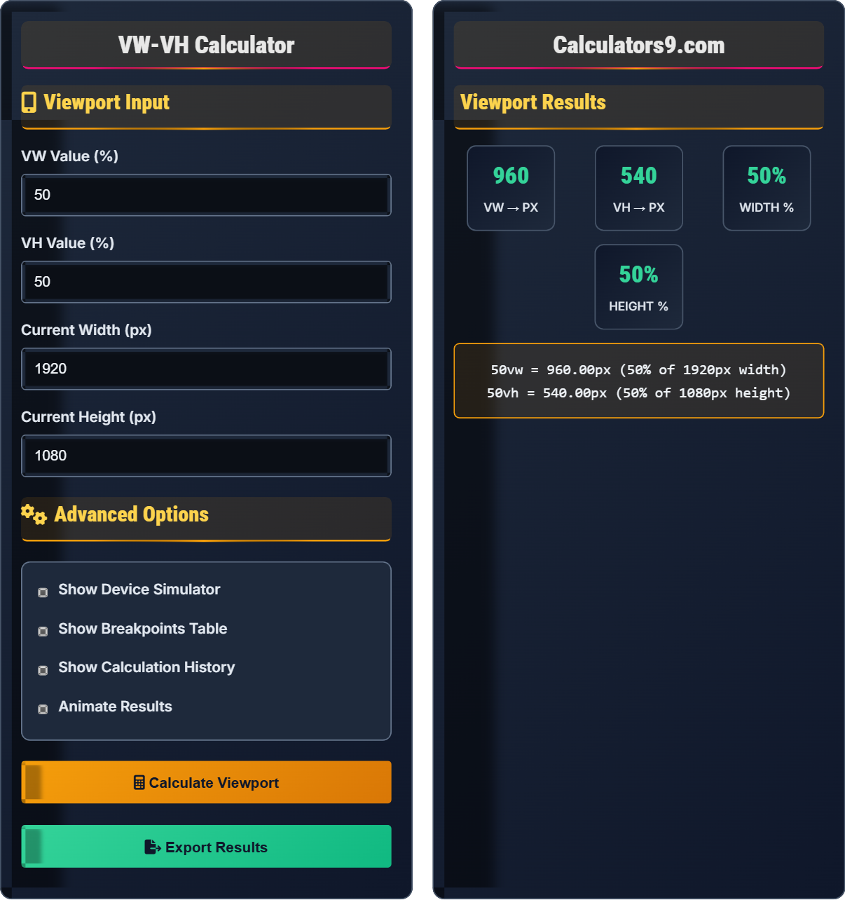
Viewport Input

Advanced Options

Viewport Results

960
VW → PX
540
VH → PX
50%
WIDTH %
50%
HEIGHT %
50vw = 960px (50% of 1920px width)
50vh = 540px (50% of 1080px height)

Viewport Units Guide

What are Viewport Units?

Viewport units are CSS units that are relative to the size of the browser window or device screen. They provide a way to create truly responsive designs that scale perfectly with the user's viewport dimensions. These units are particularly valuable for creating fluid layouts that adapt seamlessly to different screen sizes.

Viewport Unit Conversion Formulas

The fundamental conversion formulas for viewport units are:

\(px = \frac{unit \times viewportDimension}{100}\)

Where:

  • \(px\) = pixel value
  • \(unit\) = the viewport unit value (vw, vh, vmin, vmax)
  • \(viewportDimension\) = the corresponding viewport dimension in pixels

Types of Viewport Units
1
VW (Viewport Width): 1vw equals 1% of the viewport width. Scales horizontally with screen width.
2
VH (Viewport Height): 1vh equals 1% of the viewport height. Scales vertically with screen height.
3
VMIN (Viewport Minimum): 1vmin equals 1% of the smaller dimension (width or height).
4
VMAX (Viewport Maximum): 1vmax equals 1% of the larger dimension (width or height).
When to Use Each Viewport Unit

Choosing the right viewport unit depends on your specific responsive design needs:

  • VW: Use for horizontal scaling, full-width sections, and responsive typography that scales with screen width
  • VH: Use for vertical scaling, full-height sections, and creating elements that utilize screen height
  • VMIN/VMAX: Use for perfect squares or circles that maintain aspect ratio on all devices
  • Combination: Use VW for width and VH for height to create responsive containers
Best Practices
  • Limit maximum sizes: Combine with max-width/max-height to prevent oversized elements
  • Consider typography: Use VW units carefully for text to ensure readability
  • Test across devices: Verify designs work on various screen sizes and orientations
  • Fallbacks: Provide pixel fallbacks for older browsers that don't support viewport units

Viewport Units Fundamentals

VW vs VH

VW is relative to viewport width, VH is relative to viewport height.

Conversion Formula

\(px = \frac{vw \times viewportWidth}{100}\)

Where px=pixels, vw=viewport width, viewportWidth=current screen width.

Key Rules:
  • 1vw = 1% of viewport width
  • 1vh = 1% of viewport height
  • Values change with screen size

Responsive Design

Responsive Sizing

Viewport units ensure designs adapt perfectly to any screen size and orientation.

Implementation
  1. Use VW for horizontal scaling
  2. Use VH for vertical scaling
  3. Combine with media queries
  4. Test across devices
Considerations:
  • Browser compatibility
  • Readability concerns
  • Maximum size limits
  • User experience factors

CSS Code Examples

Basic Viewport Unit Implementation
/* Full viewport container */
.full-screen
{
width
: 100vw;
height
: 100vh; }

/* Responsive typography */
.responsive-text
{
font-size
: 4vw;
line-height
: 1.2; }

/* Square element with vmin */
.square-box
{
width
: 20vmin;
height
: 20vmin; }
Advanced Viewport Techniques
/* Clamp with viewport units */
.responsive-heading
{
font-size
: clamp(1.5rem, 4vw, 3rem); }

/* Grid with viewport units */
.grid-container
{
display
: grid;
grid-template-columns
: repeat(auto-fit, minmax(25vw, 1fr)); }

/* Responsive padding */
.section
{
padding
: 5vh 10vw; }

Viewport Unit Details

VW (Viewport Width)

One viewport width unit (vw) is equal to 1% of the viewport's width. For example, if the viewport is 1000px wide, then 1vw equals 10px. This unit is excellent for creating elements that scale horizontally with the screen width.

Formula: \(1vw = \frac{viewportWidth}{100}\)

VH (Viewport Height)

One viewport height unit (vh) is equal to 1% of the viewport's height. For example, if the viewport is 800px tall, then 1vh equals 8px. This unit is ideal for creating full-height sections or elements that scale with screen height.

Formula: \(1vh = \frac{viewportHeight}{100}\)

VMIN and VMAX

VMIN is 1% of the smaller viewport dimension (width or height), while VMAX is 1% of the larger dimension. These units are useful for creating elements that scale relative to the smallest or largest screen dimension, ensuring consistent proportions across different aspect ratios.

Viewport Units Learning Quiz

Question 1: Multiple Choice - VW vs VH Understanding

What is the difference between VW and VH units in CSS?

Solution:

The answer is B) VW scales with width, VH scales with height. VW (Viewport Width) units scale relative to the viewport's width, while VH (Viewport Height) units scale relative to the viewport's height. This means 1vw equals 1% of the viewport width, and 1vh equals 1% of the viewport height.

Pedagogical Explanation:

Understanding the directional nature of viewport units is crucial for responsive design. VW units are perfect for creating elements that maintain proportional width across different screen sizes, while VH units are ideal for full-height sections or elements that need to scale with screen height. This directional specificity allows for precise control over responsive layouts.

Key Definitions:

VW: Viewport Width - relative to viewport width

VH: Viewport Height - relative to viewport height

Viewport: The visible area of the web page

Important Rules:

• 1vw = 1% of viewport width

• 1vh = 1% of viewport height

• Values change with screen dimensions

Tips & Tricks:

• Use VW for horizontal scaling

• Use VH for vertical scaling

• Remember: W=Width, H=Height

Common Mistakes:

• Confusing VW with VH in layout planning

• Not accounting for mobile address bars

• Assuming both units behave identically

Question 2: Viewport Unit Conversion Formula Application

On a device with a screen width of 375px, what is the pixel equivalent of 80vw? Show your work.

Solution:

Using the conversion formula: \(px = \frac{vw \times viewportWidth}{100}\)

Given:

  • vw = 80
  • viewportWidth = 375px

Calculation: \(px = \frac{80 \times 375}{100} = \frac{30000}{100} = 300px\)

Therefore, 80vw equals 300px on a 375px wide screen.

Pedagogical Explanation:

This problem demonstrates the direct proportional relationship between VW units and pixel values. The calculation is straightforward: multiply the VW percentage by the viewport width and divide by 100. This relationship ensures that viewport units maintain their proportional size regardless of the actual screen dimensions.

Key Definitions:

Proportional Relationship: Direct relationship where values change together

Viewport Width: Current width of the browser window

Pixel Equivalent: Absolute measurement derived from relative unit

Important Rules:

• Always identify the viewport dimensions first

• Multiplication factor is always the viewport dimension

• The formula is always px = (vw × viewportWidth) / 100

Tips & Tricks:

• Remember the formula: px = (vw × width) / 100

• Test on multiple screen sizes

• Consider mobile first approach

Common Mistakes:

• Forgetting to divide by 100

• Using incorrect viewport dimensions

• Mixing up width and height calculations

Question 3: Word Problem - Responsive Design

A web designer wants to create a hero section that takes up 100% of the viewport height on desktop (1920×1080) and 80% on mobile (375×667). Calculate the VH values needed for each and explain the responsive advantage.

Solution:

For desktop (100% height): 100vh = 100% of 1080px = 1080px

For mobile (80% height): 80vh = 80% of 667px = 533.6px

The responsive advantage is that the section automatically adjusts to different screen heights, providing an optimal viewing experience across devices while maintaining proportional sizing.

Pedagogical Explanation:

This example illustrates how viewport units provide automatic responsiveness. Instead of using fixed pixel values that would look different on various devices, VH units ensure the element maintains the intended proportional relationship to the screen height. This creates a more consistent user experience across all devices.

Key Definitions:

Responsive Design: Design that adapts to different screen sizes

Proportional Sizing: Maintaining relationships between elements

Hero Section: Prominent section at the top of a webpage

Important Rules:

• VH units scale with viewport height

• Proportional values maintain design intent

• Different devices may need different percentages

Tips & Tricks:

• Use 100vh for full-screen sections

• Consider mobile address bars

• Test on various devices

Common Mistakes:

• Using 100vh on mobile (address bar issues)

• Not considering different aspect ratios

• Assuming same percentage works for all devices

Question 4: Application-Based Problem - Typography Scaling

A designer wants to create a responsive headline that scales with screen width using VW units. If they want the text to be 24px on a 375px mobile screen, what VW value should they use? Calculate the resulting size on a 1920px desktop screen.

Solution:

Step 1: Find VW value for 24px on 375px screen:

Using formula: \(vw = \frac{px \times 100}{viewportWidth}\)

\(vw = \frac{24 \times 100}{375} = \frac{2400}{375} = 6.4vw\)

Step 2: Calculate size on 1920px desktop:

\(px = \frac{6.4 \times 1920}{100} = \frac{12288}{100} = 122.88px\)

So 6.4vw equals 24px on mobile and 122.88px on desktop.

Pedagogical Explanation:

This demonstrates how viewport units can create fluid typography that scales appropriately across devices. By using the inverse formula to find the VW value, we ensure the text appears at the desired size on the mobile screen, then scales proportionally on larger screens. This creates a responsive typography system that maintains readability across all devices.

Key Definitions:

Fluid Typography: Text that scales smoothly across screen sizes

Responsive Scaling: Automatic adjustment based on context

Typography System: Coordinated text sizing approach

Important Rules:

• Use inverse formula to find desired VW value

• Test readability on all screen sizes

• Consider minimum and maximum sizes

Tips & Tricks:

• Use clamp() to limit scaling extremes

• Start with mobile target size

• Test across the entire range

Common Mistakes:

• Not limiting maximum text sizes

• Creating unreadably small text

• Forgetting to consider all devices

Question 5: Multiple Choice - Best Practices

Which of the following represents the best practice for viewport unit usage?

Solution:

The answer is B) Combine VW for width, VH for height with limits. This approach leverages the strengths of viewport units for responsive design while implementing safeguards (like max-width/max-height) to prevent elements from becoming too large or small. This creates designs that are both responsive and maintain usability across all screen sizes.

Pedagogical Explanation:

Modern responsive design best practices advocate for a balanced approach using viewport units strategically. VW units excel at creating horizontally scalable elements, while VH units work well for vertically scalable components. However, combining them with limiting constraints (like max-width, max-height, or clamp()) ensures the design remains usable and readable across the full spectrum of possible screen sizes.

Key Definitions:

Best Practice: Proven approach that achieves optimal results

Limited Scaling: Constraining viewport unit growth

Responsive Balance: Combining techniques effectively

Important Rules:

• Use VW for horizontal scaling

• Use VH for vertical scaling

• Implement size limits to prevent extremes

Tips & Tricks:

• Use clamp() for controlled scaling

• Combine with traditional units

• Test extreme screen sizes

Common Mistakes:

• Using viewport units without limits

• Not testing on various devices

• Creating unusably large/small elements

vw-vh-calculator

FAQ

Q: What's the difference between using VW/VH and using percentage-based layouts?

A: The key difference lies in what they're relative to:

  • Percentages: Relative to the parent element's dimensions
  • Viewport units: Relative to the entire viewport dimensions

For example, 50% width on a child element means 50% of its parent's width, while 50vw always means 50% of the entire viewport width regardless of parent size.

Mathematically: \(px = \frac{vw \times viewportWidth}{100}\) vs \(px = \frac{\% \times parentWidth}{100}\)

This makes viewport units ideal for full-screen layouts and responsive elements that should scale with the entire screen.

Q: Are there any browser compatibility issues with viewport units?

A: Modern browser support for VW and VH units is excellent (95%+ globally), but there are some considerations:

  • Mobile Safari: Can have issues with 100vh when address bars are present
  • Older browsers: IE9 and below don't support viewport units
  • Android Browser: Some versions have calculation bugs

Best practice is to provide fallbacks for critical elements: height: 500px; height: 100vh; where the pixel value serves as a fallback for unsupported browsers.

About

CSS Team
This calculator was created
This calculator was created by our Web & Development Team , may make errors. Consider checking important information. Updated: April 2026.